Unit 2 Summary

If Mesopotamian, Ancient Egyptian, Greek and Roman art were looked together you would be able to identify the change from each other. The form of art depicted ranges from the worshiping of Gods to showing the potential of human beings. Each of these civilizations influences each other which shows change and adaptation in both society and art. First of all, in Mesopotamia one art showing worshiping is the Statue of Gudea in 2150 BCE in Neo Sumeria. The small stone figure is made to be durable and last a while. It can also be seen as a someone with a high status worshiping their religion or praying to a God due to their composure being seated and his hands together with a humble look.

Image result for statue of gudea

Moving on to Ancient Egypt is another example of worshiping. However, the pharaohs were looked upon as rulers are praised highly. Their social status was at the peak and were known to have a form of communication to the gods. They were the chain which connected the people to the many gods. The statue shown below is Menkaure and Queen 2491-2472 BCE which are the pharaoh and queen standing next to each other. It looks like it has been made through a similar material as the previous art, the Gudea. Their posture shows the superiority and power of the two. They are posed in an ideal posture. Their feet are close to each other while standing up vertically. Their are similarities to Mesopotamia and Egyptian art as seen between these two statues. The stiffness in their poses to the chunky like construction give it’s durability and strength. Also, they are posing as if they were prepared to be frozen in this moment.

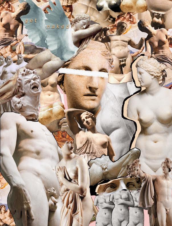
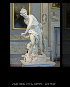
One Greek statue that displays a young male is Kuros. The figure is nude, which represents its appreciation of the body in Greek art. The statue shows the physique of a young adult while displaying the softness of a human body at the same time. Kuros is standing straight, facing forward with two feet almost together, meaning the equal distribution of weight of the entire body. The curves in the facial features such as eyebrows and eyelid down to the knee caps resonate to a natural human body.

Image result for kuros


final project


First off I am not really “good” at drawing but am proud that I could figure out the anatomy of the body. I think  got the idea of the male figure close enough but it still needs proper proportions.

The first problem that I had to over come was finding where to start for portions.  The length of the torso did not mach well with the rest of the body because I had started on the shoulders first and the rest of the body sort of didn’t fit into the structure and made the legs way too small and arms too short

The second one I had started on the chest down so it could better manage the portions to scale but it had issues with drawing the legs and arms. The thighs are some how small than the legs  and it looks weird the top haft seem fine but i couldn’t get the muscles to look quite right.

So I tried again with a bigger scale and it work pretty well. it fix my focus on the overall structure of the body but I still suck at drawing hands and feet so it still a failure

last one is really the better one where I learn more about curvature of lines than trying to correct them get the lines in one go or redo it because it makes it clearer. Final thoughts would be that I’ll keep drawing for a while see if i improve

Extra Credit

For my extra credit, I chose to visit a museum not related to the things we studied in our class but someone rather different. I went to the Museum of Moving Image, as it is one of my favorites because of how different it is. This museum, located near Kaufman Studios in Queens, focuses on film and television. While there are not necessarily paintings and statues like in the Metropolitan Museum or the Brooklyn Museum, there are many other interesting things to look at, such as costumes from movies, fan mail received for certain shows, cameras, and even original movie script drafts.

One thing I saw when I was there was letters from fans of “The Muppet Show.” Some of these were dated back to the 70’s and were often from kids. One specific letter was from a boy named Jay from Michigan, who wrote to the creators of The Muppets to share his concerns of the show being cancelled before he has the chance to work with the muppets. At the end of the letter he even adds a drawing of a muppet saying “We go Bye-Bye!” before signing off as “a concerned kid.” This caught my attention because it was very real and something the kid never would have thought would end up in a museum. He only wanted to discuss his worries about a show he was a fan of becoming cancelled.

Another thing I found interesting was a display of a paper with the original brainstormed ideas for the title of the 1986 film “Labyrinth” starring David Bowie  and Jennifer Connelly. I loved this movie as a child and getting to see something that was a part of the process was interesting. Some of the title ideas were “Magic Maze” and “Inside Outside.” Seeing this reminded me that while the title of a movie may seem insignificant to viewers when thinking about a whole movie, a lot of thought does go into it. The full outfits worn by David Bowie’s character were also on display and being able to examine the details of those up-close showed just how much effort actually goes into creating the clothes worn by characters in things we watch.

In my post about what art is to me, I wrote that art is not limited to just paintings and sculptures because photography, fashion, and film, are also forms of art. This museum is a perfect example of this because it proves that museums are not always just about paintings from centuries ago, they can be about things we enjoy in our daily lives too.

Final Project

Throughout this course I have seen many beautiful paintings, sculptures, and architecture. Specifically, works of art that display leaders in power and Emperors after their victories in battle. Works of art that display their great wealth and power that they have conquered but not images of the battles themselves. I would like to see the art of the Emperors campaigns and the battles that took place.

“DEPICTIONS OF WAR”

Eugène Delacroix 1831

The Battle of Nancy and the Death of Charles the Bold

The Battle of Nancy and the Death of Charles the Bold, Duke of Burgundy, January 5, 1477, Eugène Delacroix (French, Charenton-Saint-Maurice 1798–1863 Paris), Oil on canvas

This painting’s main subject was discussed with several city Administrators and members of the Royal Society of Science. Until agreeing on the min focal point, death of Charles, The bold, Duke of Burgundy. Who was killed by the Knight of Lorraine, Claude de Bauzemont on January 5 1477. This was Delacroix first official commission and took him roughly 3 years to complete. “What is striking about this canvas is the exalted enthusiasm with which the artist detail the murderous tumult of the battle.” www.eugene-delacroix.com/

Delacroix used a warm and inviting red that had be complement well with the blue snowy background. Overall, the canvas brought together displaying the large scale of war in a small canvas.

Eugène Delacroix  1835

Combat of the Giaour and Pasha

Combat of the Giaour and Hassan, Eugène Delacroix (French, Charenton-Saint-Maurice 1798–1863 Paris), Oil on canvas

Eugène Delacroix 1830

Based on the story’s of Lord Byron about a slave, Lelia who was killed by her master, Hasen. And Giaour her lover on a mission for revenge.

Delacroix’s “Combat of Giaour and Pasha is a powerful constantly moving image clashing two soldier rising their horse at each other/ Delacroix plays with the shadow and light between the left and right side split the image down the middle and unveiling and underlying battle between light and dark.

The Battle of Poitier

The Battle of Poitiers, Eugène Delacroix (French, Charenton-Saint-Maurice 1798–1863 Paris), Oil on canvas

Eugène Delacroix 1826

Commissioned by the Duchess of Berry, displaying a battle fought between Edward, Prince of Wales and John II of France. Delacroix captures the tipping point of this battle and the last moments of the kings freedom before he is taken prisoner. Using dark tones Delacroix painting vibrates of the grim view of war.

Combat of the Giaour and HassanCombat of the Giaour and Hassan, Eugène Delacroix (French, Charenton-Saint-Maurice 1798–1863 Paris), Oil on canvas

Eugène Delacroix 1831

For a Scene displaying so much violence Delacroix’s brush work and choice of wide range of red, blue, and yellows, create a vibrant yet powerful duel on horses.

Boissy d’Anglas at the Convention

Boissy d'Anglas at the Convention, sketch, Eugène Delacroix (French, Charenton-Saint-Maurice 1798–1863 Paris), Oil on canvas

Delacroix paints a dark image of the storming of the Convention and decapitation of the head of deputy Feraud. Delacroix  dark images is matched with dark colors and bright red counter to really exaggerate the bloody scene.

The 18 greatest War and Battle painting, helped me compare the works of war from Delcroix to other artist from other periods. The one artwork that stood out the most for me would be Albercht Altdorfer, The Battle of he Alexander at Issus 1529. The paining has the most beautiful depiction of heaven or peace and calm emitted from the blue but on the other hand at the bottom chaos and a clash of waves of soldier and red blood is steered all the way to the horizon.


greatest war paintings

This article further helped me understand the different focuses the artist have when is comes to painting war. Peter Paul Rubens “Consequences of War” doesn’t display actual acts of war but rather , the God of war Mars marching thru the temple of Janus while Venus attempts to hold him back.

greatest war paintings


Bibliography

http://www.eugene-delacroix.com/

https://www.artic.edu/artists/40545/eugene-delacroix

https://www.metmuseum.org/

Article ( I only used 1 article, since it covered a wide period and 18 different articles about my theme)

https://explorethearchive.com/the-18-greatest-war-and-battle-paintings-of-all-time

Final Project: The Female and The Male Nude

When examining sculptures throughout various eras of art, it is now evident that many are nude. The nude is a significant part of art and it’s implications are just as significant, especially in Greco-Roma/Western art. However, it appears that more often than not, there are more male nude figures than the female figures, which poses the question of why this is. Further exploration of nude sculptures from the time periods prove that there are in fact many differences between the nude sculptures of men and women.

The emergence of the nude became more frequent in ancient Greek art. In the art from this decade, we see various different nude male sculptures with the ideal male body because the Greeks, unlike other ancient civilizations, did not associate the nude with indecency and weakness. These sculptures have athletic bodies and this was done as a way to signify everything the people of that time valued the most, such as, success, power, strength, and glory. The Greek youth already spent time in the nude when training or competing in athletic events so the nude was natural for them. In his book “Greek Art: From Prehistoric to Classical: a Resource for Educators” Michael B. Norris states that the Greek associated being in the nude to “heroic excellence.” For example, for my project one of the artworks I looked at was the 1st-2nd century Roman copy of the Marble statue of the Diandoumenos by Polykleitos from 430 B.C. that can be found at the MET. The statue depicts an athletic youth tying a fillet around his head; the MET’s description of the statue states that “the position of the feet- poised between standing and walking- gives a sense of potential movement,” which shows that the artists cared to show that the statues didn’t just have athletic figures but was actually moving and participating athletics. There are various copies of this statue and they imitate Polykleitos’ original portrayal of the male body because Polykleitos paid careful attention to his statues’ body parts, proportions, and stances. This is done not only to make the figures accurate but to help the audience get a proper sense of the heroic strength the statues are meant to exude. Norris also explains the importance of a well-proportioned body by stating that a “perfect proportioned, well-trained body was considered an outward manifestation of the striving for excellence that marked a hero.”

Most nude male statues do not shy away from illustrating the details of the male genitalia. However, when it comes to female nude statues it is the exact opposite. From all the different female statues that I examined, none of them were explicit with the detailing of the female genitals. This can be traced back to the fact that many viewed the female nude as a symbol of sex and sexuality and viewed that as shameful if it was not focused on fertility. For years, the female body was not shown in the nude unless it was the Goddess of Love, Aphrodite. This only started after the Aphrodite of Knidos by Prexiteles was created and became one of the very first sculptures of a nude female, setting precedent for other female nude sculptures. Nonetheless, breasts were not as taboo and are shown more commonly. The marble statue of a wounded Amazon (found at the MET), for example, shows an Amazonian woman with an injury under her right breast, while the other breast is covered with her clothes. Another example is the Marble statue of a Seated Muse, which shows a muse sitting on a rock. While her breasts her exposed, the lower half of her body is covered with clothing.

For my project I chose to create a collage of various sculptures in the nude. In my collage, you can see the differences in the depictions of male genitalia versus the female; one is almost always more detailed than the other. The male’s perfect athletic bodies are also shown and the females’ breasts are visible in all the artworks shown. The differences between the bodies of men and women in sculptures is evident when look at art. The power of art is that we can get a message across just by showing, so rather than using words to compare the difference between Michelangelo’s “David” and a statue of Aphrodite, I chose to juxtapose the numerous female and male statues in a collage as a good way to look into this.

Final Project

The Differences Between Renaissance and Baroque Art 

Renaissance and baroque art are often viewed as similar. This could be because both eras were good at using realism and according to Renaissance Art vs. Baroque Art: Understanding the Difference by lee down “Both styles use vivid, evocative pigments, and, what is perhaps most vexing is that, where subject matter is concerned, both eras have strong emphases on topics from the Judeo-Christian Bible or from Greco-Roman mythology.” Another reason why they were sometimes similar is due to the fact that Baroque artist would recreate Renaissance art. Although the art was sometimes similar there are various important differences that make each era unique and help us differentiate them. Here I will be discussing the differences between the two era’s art. For the Final Project I chose to do prompt number three the Creative project. While doing the Met assignment I found myself very interested in the differences between Renaissance and Baroque art that I decided to make my final project thesis on it. I researched both time periods, read and watched videos on how they differed and analyzed various paintings and sculptures as well.  

The Renaissance began in the 1400s and ended in the 1600s. It was a very important time period for it brought about many new things and was known as the rebirth. There was a shift of focus to humanism which means there was a greater importance placed on humans rather than divine beings. The Renaissance was also known for its many artists. Like Brunelleschi who founded linear perspective which gave gave depth to 2D art with the use of the Vanishing point. He was also known for creating the dome in architecture. There were various other great artist known from that time such as the famous four Michelangelo, Raphael, Donatello, and Leonardo.

The Baroque era began from in the 1600s and lasted till the 1700s. Around this time the Catholic church was undergoing changes with the Protestant Reformation taking place. As a result the catholic church felt a new way of biblical art was needed in order to keep and counter the Protestant reformation so art became more forceful, emotional and had greater realism. Which was also found in Protestant art and other European countries.

With the focus on perspective and adding depth in Renaissance art the paintings and sculptures would often lack emotion and appeared to be still. Renaissance art focused on stability with pyramid shaped compositions or the use of vertical and straight lines. While Baroque art emphasizes emotion and was known as dramatic. Baroque art used emotional intensity, dynamism, diagonals, was involving, real, interrupted contours, movement and had direct focus. For the creative aspect of the project I recreated two different Davids. One was based on Michelangelo’s David 1501-4 which was from the Renaissance and the other was based on Bernini’s David, 1623-24 from the Baroque era. Although my drawings were based on two different full body sculptures I drew the faces or focused on David’s portrait yet tried to convey the different styles from both periods. In Michelangelo’s sculpture David is more straight and vertical with some contropasto he shows some emotion but it is more eternal as opposed to Bernini’s who looks like it is a moment in time with a look of anger and concentration. Bernini’s David also has diagonals and appears to be moving more dramatic.

Sculptures I based my Drawing on 

Renaissance Art

Baroque Art

My Art Story

What we mean when we say art we mean how the art looks and the meaning behind it. We want to see what is going on in the piece if there is something that the artist wanted to display whether it is certain features or a theme in their piece of art. Art is meaningful to me because I have seen a lot of art through my life through myself and friends who enjoy drawing. It fits into my life because I have transitioned into doing a lot of digital art. I feel like I can learn from this class because I can learn about the things the history of art and more importantly the styles that have stayed the same and things that civilizations have enjoyed so I can see if I can incorporate it into my own work.

Final Project

Ariel A. Benzur 

Professor Shaw 

Art 1010 

December 7th, 2018 

Renaissance & Baroque Ideology: A Tour at The Met Fifth Avenue 

          After the fall of the Byzantine Empire, Italy learned of cultures outside of its country. This led to what’s known as the Renaissance & Baroque periods & Baroque periods. The Renaissance & Baroque periods & Baroque periods went through the fourteenth through eighteenth centuries that focused on the idea of humanism. However, humanism in the Renaissance & Baroque periods were different compared to Ancient Greek Humanism. Including the belief that humans should be focused more on themselves instead of gods, the Renaissance & Baroque periods created the belief that we had the potential to become excellent though studying. The Renaissance & Baroque periods changed the world in many ways. Furthermore, one of the most prominent changes in modern art is the art of the Renaissance & Baroque periods. 

The first painting, Ancient Rome by Giovanni Paolo Panini painted in 1757 which can be seen in Gallery 629, shows us what Rome was. The painting depicts famous pieces of art created in the times of Ancient Rome, some of these pieces include famous Italian landmarks, Trajan’s column, the Farnese Hercules, and the Laocoön. The color and tone of the painting is bright as well as its linear design gives everyone a better view of Rome’s beautiful art history. This painting changed the world by showing everyone the true beauty of Ancient Roman art but at the same time using “modern” techniques. 

The second painting, Federico Gonzaga by Francesco Francia painted in 1510 which can be seen at Gallery 643, exemplifies what the Renaissance & Baroque periods changed. The painting is a portrait of a boy named Federico who was ten at the time of the painting. The color is bright for the background however the child is wearing a dark outfit. The linear pattern along this painting is 2D but in some angles looks as if it were 3D. It is a normal sized portrait size at 19×14 inches. What makes this painting so great is how different the style is against the older times as it is more intricate and detailed versus a painted from the Renaissance & Baroque periods. 

The third painting, Lute Player by Valentin de Boulogne painted in 1625 & 1626 which can be seen at Gallery 634, shows the integration of other cultures into Italian culture. The painted depict a lute player playing his lute. The painting is in dark colors with an entirely black background. The lines on this picture is linear which is a commonality in all Renaissance art. The use of oil painting in this piece allowed Boulogne gave him the ability to place more delicate features on the player’s face & body.  Boulogne who was a French painter followed famous Italian artist Caravaggio, which allowed Boulogne to bring new art ideas into Roman art. 

The fourth painting, Man with a Magnifying Glass by Rembrandt painted in the early 1660’s which can be seen at Gallery 964, shows the idea of humanism being integrated into Roman culture. The painting depicts an Amsterdam auctioneer who sold off one of Raphael’s pieces. The color is ominous giving the tone of the piece a darker feel. This may be due to the auctioneer’s old age which can be seen due to the use of oil painting. Rembrandt used oil painting to provide intricate details like wrinkles. The use of a regular person as the main feature instead of a god-like human or an actual god in the piece shows off what the Romans have learnt through the Renaissance & Baroque periods. 

The fifth painting, Curiosity by Gerard ter Borch the Younger painted in the early 1660’s which can be seen at Gallery 964. This painting depicts three women writing a letter, which is very odd due to the fact that most people weren’t literate and in turn couldn’t write. The color and tone of the picture is dark with only the women’s dresses painted with light colors. Dutch women who were rich were able to read and write because of the way the Dutch were raised. Unlike the Dutch, European countries wanted women to only do housework and not to learn anything else. The furniture in the background gives the picture a Renaissance & Baroque feel due to it being modern-like. 

This museum tour which you can go on in The Met on Fifth Avenue exemplifies the Renaissance & Baroque periods showing the past Roman art via Ancient Rome and the present through the other four pictures. Showing off the art of the Renaissance & Baroque periods is important because many current paintings are inspired through painting done in the Renaissance & Baroque periods and without the Renaissance happening, art in this world would look completely different and less intricate unlike what we have today.