Posts
Final Project
In my project I did beauty norms throughout history. I decided to do the second choice of the museum tour. This is the link to my presentation.
https://docs.google.com/presentation/d/1qC5gZwqV7uIMmPHjvdkl56nC5YbQ6ajBhMBOHp7hZ8o/edit?usp=sharing
Citations
“Arrayed in Gold.” Portraits of the Empress Elizabeth of Austria, 20 Aug. 2011, arrayedingold.blogspot.com/2011/08/napoleons-beautiful-enemy-louise-of.html.
- This website helped me understand who Queen of Prussia was and why was she known. This also where I got her portrait during her time period, she was considered the most beautiful woman.
Geri Walton. “Ideas of Female Beauty in the 1700 and 1800s.” Geri Walton, 4 Nov. 2016, www.geriwalton.com/ideas-of-female-beauty-in-1700-and-1800s/.
- This helped me with my project because it gave me specific features that were considered beautiful during the 1700s and the 1800s. What exact physical features were looked for in a woman in order to be found attractive and beautiful. Also how it all depended on what was going on during that time.
Howard, Jacqueline. “The Ever-Changing ‘Ideal’ of Female Beauty.” CNN, Cable News Network, 9 Mar. 2018, www.cnn.com/2018/03/07/health/body-image-history-of-beauty-explainer-intl/index.html.’
- This helped me gather some of my paintings. It also gave me background in how beauty has changed.
Kunitz, Daniel. “What Art History Can Teach Us about Female Beauty Ideals.” 11 Artworks, Bio & Shows on Artsy, Artsy, 2 Jan. 2017, www.artsy.net/article/artsy-editorial-how-art-has-shaped-female-beauty-ideals-history.
- In this article the author demonstrated different artworks that represent the beauty norms that were expected on women. It compared different pieces of artwork that portray what was considered beautiful in different societies.
Romm, Sharom. “BEAUTY THROUGH HISTORY.” The Washington Post, WP Company, 27 Jan. 1987, www.washingtonpost.com/archive/lifestyle/wellness/1987/01/27/beauty-through-history/301f7256-0f6b-403e-abec-f36c0a3ec313/?utm_term=.63d6ef6dd351.
- This article helped understand on what exact physical features society looked on a women in order to consider her beautiful in Greek times. What I mostly got out of it was that the most important a woman needed was symmetry in order to be considered beautiful.
“The Art of the Renaissance: In the Line of Beauty.” The Independent, Independent Digital News and Media, 23 Oct. 2011, www.independent.co.uk/arts-entertainment/art/features/the-art-of-the-renaissance-in-the-line-of-beauty-1955030.html.
- This article helped to further understand that furing this type period a lot of changing. The focus to humans was changing and physical features were being focused on. The nature of nature became big.

Art History Final Project
Extra Credit
For my extra credit, I chose to visit a museum not related to the things we studied in our class but someone rather different. I went to the Museum of Moving Image, as it is one of my favorites because of how different it is. This museum, located near Kaufman Studios in Queens, focuses on film and television. While there are not necessarily paintings and statues like in the Metropolitan Museum or the Brooklyn Museum, there are many other interesting things to look at, such as costumes from movies, fan mail received for certain shows, cameras, and even original movie script drafts.
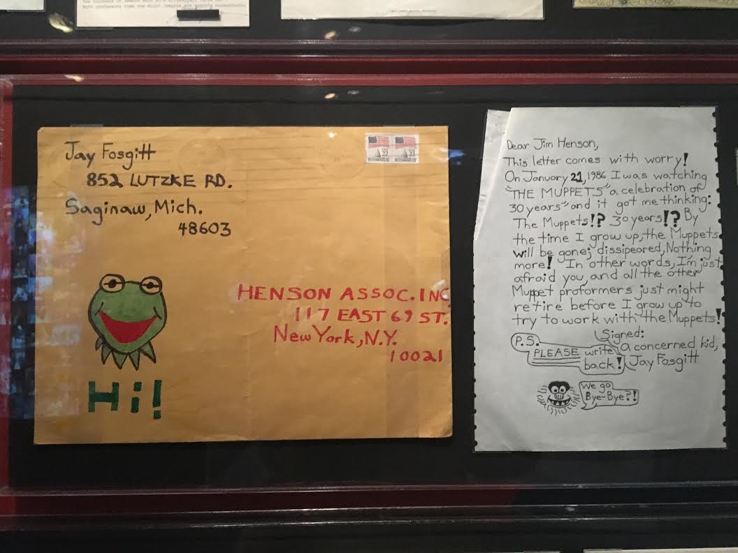
One thing I saw when I was there was letters from fans of “The Muppet Show.” Some of these were dated back to the 70’s and were often from kids. One specific letter was from a boy named Jay from Michigan, who wrote to the creators of The Muppets to share his concerns of the show being cancelled before he has the chance to work with the muppets. At the end of the letter he even adds a drawing of a muppet saying “We go Bye-Bye!” before signing off as “a concerned kid.” This caught my attention because it was very real and something the kid never would have thought would end up in a museum. He only wanted to discuss his worries about a show he was a fan of becoming cancelled.
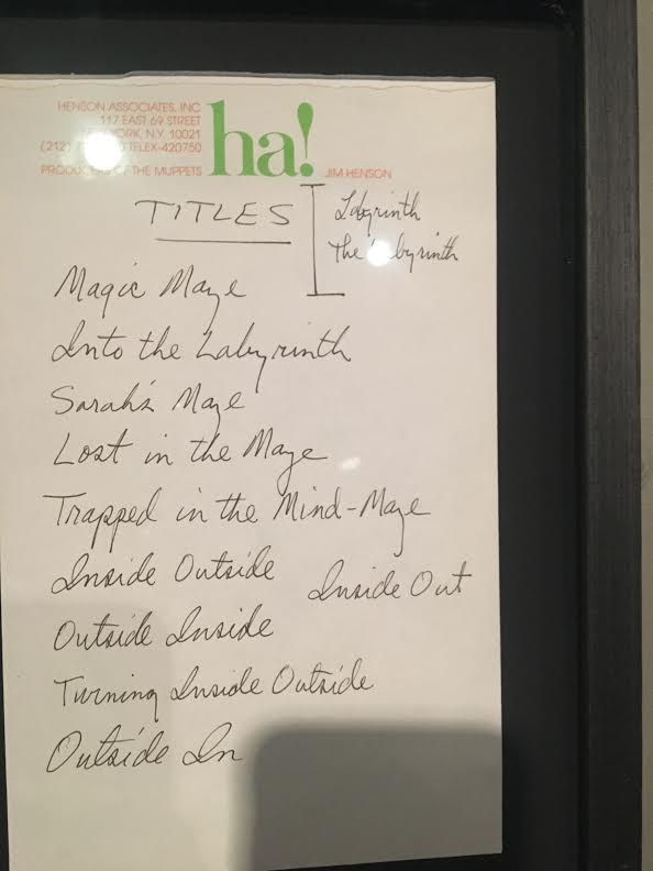
Another thing I found interesting was a display of a paper with the original brainstormed ideas for the title of the 1986 film “Labyrinth” starring David Bowie and Jennifer Connelly. I loved this movie as a child and getting to see something that was a part of the process was interesting. Some of the title ideas were “Magic Maze” and “Inside Outside.” Seeing this reminded me that while the title of a movie may seem insignificant to viewers when thinking about a whole movie, a lot of thought does go into it. The full outfits worn by David Bowie’s character were also on display and being able to examine the details of those up-close showed just how much effort actually goes into creating the clothes worn by characters in things we watch.
In my post about what art is to me, I wrote that art is not limited to just paintings and sculptures because photography, fashion, and film, are also forms of art. This museum is a perfect example of this because it proves that museums are not always just about paintings from centuries ago, they can be about things we enjoy in our daily lives too.
Final Project
Throughout this course I have seen many beautiful paintings, sculptures, and architecture. Specifically, works of art that display leaders in power and Emperors after their victories in battle. Works of art that display their great wealth and power that they have conquered but not images of the battles themselves. I would like to see the art of the Emperors campaigns and the battles that took place.
“DEPICTIONS OF WAR”
Eugène Delacroix 1831
The Battle of Nancy and the Death of Charles the Bold
This painting’s main subject was discussed with several city Administrators and members of the Royal Society of Science. Until agreeing on the min focal point, death of Charles, The bold, Duke of Burgundy. Who was killed by the Knight of Lorraine, Claude de Bauzemont on January 5 1477. This was Delacroix first official commission and took him roughly 3 years to complete. “What is striking about this canvas is the exalted enthusiasm with which the artist detail the murderous tumult of the battle.” www.eugene-delacroix.com/
Delacroix used a warm and inviting red that had be complement well with the blue snowy background. Overall, the canvas brought together displaying the large scale of war in a small canvas.
Eugène Delacroix 1835
Combat of the Giaour and Pasha
Eugène Delacroix 1830
Based on the story’s of Lord Byron about a slave, Lelia who was killed by her master, Hasen. And Giaour her lover on a mission for revenge.
Delacroix’s “Combat of Giaour and Pasha is a powerful constantly moving image clashing two soldier rising their horse at each other/ Delacroix plays with the shadow and light between the left and right side split the image down the middle and unveiling and underlying battle between light and dark.
The Battle of Poitier
Eugène Delacroix 1826
Commissioned by the Duchess of Berry, displaying a battle fought between Edward, Prince of Wales and John II of France. Delacroix captures the tipping point of this battle and the last moments of the kings freedom before he is taken prisoner. Using dark tones Delacroix painting vibrates of the grim view of war.
Combat of the Giaour and Hassan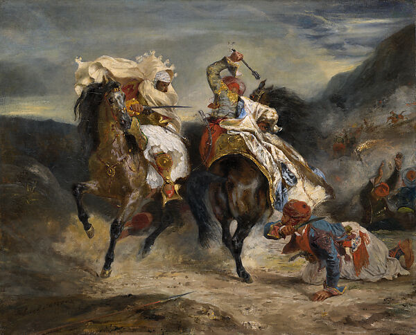
Eugène Delacroix 1831
For a Scene displaying so much violence Delacroix’s brush work and choice of wide range of red, blue, and yellows, create a vibrant yet powerful duel on horses.
Boissy d’Anglas at the Convention
Delacroix paints a dark image of the storming of the Convention and decapitation of the head of deputy Feraud. Delacroix dark images is matched with dark colors and bright red counter to really exaggerate the bloody scene.
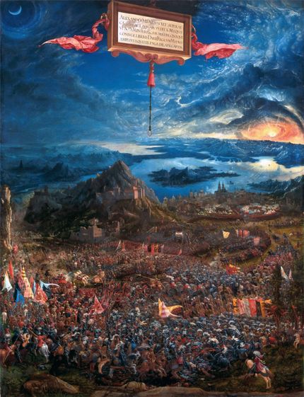
The 18 greatest War and Battle painting, helped me compare the works of war from Delcroix to other artist from other periods. The one artwork that stood out the most for me would be Albercht Altdorfer, The Battle of he Alexander at Issus 1529. The paining has the most beautiful depiction of heaven or peace and calm emitted from the blue but on the other hand at the bottom chaos and a clash of waves of soldier and red blood is steered all the way to the horizon.
This article further helped me understand the different focuses the artist have when is comes to painting war. Peter Paul Rubens “Consequences of War” doesn’t display actual acts of war but rather , the God of war Mars marching thru the temple of Janus while Venus attempts to hold him back.

Bibliography
http://www.eugene-delacroix.com/
https://www.artic.edu/artists/40545/eugene-delacroix
https://www.metmuseum.org/
Article ( I only used 1 article, since it covered a wide period and 18 different articles about my theme)
https://explorethearchive.com/the-18-greatest-war-and-battle-paintings-of-all-time
Final Project: The Female and The Male Nude
When examining sculptures throughout various eras of art, it is now evident that many are nude. The nude is a significant part of art and it’s implications are just as significant, especially in Greco-Roma/Western art. However, it appears that more often than not, there are more male nude figures than the female figures, which poses the question of why this is. Further exploration of nude sculptures from the time periods prove that there are in fact many differences between the nude sculptures of men and women.
The emergence of the nude became more frequent in ancient Greek art. In the art from this decade, we see various different nude male sculptures with the ideal male body because the Greeks, unlike other ancient civilizations, did not associate the nude with indecency and weakness. These sculptures have athletic bodies and this was done as a way to signify everything the people of that time valued the most, such as, success, power, strength, and glory. The Greek youth already spent time in the nude when training or competing in athletic events so the nude was natural for them. In his book “Greek Art: From Prehistoric to Classical: a Resource for Educators” Michael B. Norris states that the Greek associated being in the nude to “heroic excellence.” For example, for my project one of the artworks I looked at was the 1st-2nd century Roman copy of the Marble statue of the Diandoumenos by Polykleitos from 430 B.C. that can be found at the MET. The statue depicts an athletic youth tying a fillet around his head; the MET’s description of the statue states that “the position of the feet- poised between standing and walking- gives a sense of potential movement,” which shows that the artists cared to show that the statues didn’t just have athletic figures but was actually moving and participating athletics. There are various copies of this statue and they imitate Polykleitos’ original portrayal of the male body because Polykleitos paid careful attention to his statues’ body parts, proportions, and stances. This is done not only to make the figures accurate but to help the audience get a proper sense of the heroic strength the statues are meant to exude. Norris also explains the importance of a well-proportioned body by stating that a “perfect proportioned, well-trained body was considered an outward manifestation of the striving for excellence that marked a hero.”
Most nude male statues do not shy away from illustrating the details of the male genitalia. However, when it comes to female nude statues it is the exact opposite. From all the different female statues that I examined, none of them were explicit with the detailing of the female genitals. This can be traced back to the fact that many viewed the female nude as a symbol of sex and sexuality and viewed that as shameful if it was not focused on fertility. For years, the female body was not shown in the nude unless it was the Goddess of Love, Aphrodite. This only started after the Aphrodite of Knidos by Prexiteles was created and became one of the very first sculptures of a nude female, setting precedent for other female nude sculptures. Nonetheless, breasts were not as taboo and are shown more commonly. The marble statue of a wounded Amazon (found at the MET), for example, shows an Amazonian woman with an injury under her right breast, while the other breast is covered with her clothes. Another example is the Marble statue of a Seated Muse, which shows a muse sitting on a rock. While her breasts her exposed, the lower half of her body is covered with clothing.
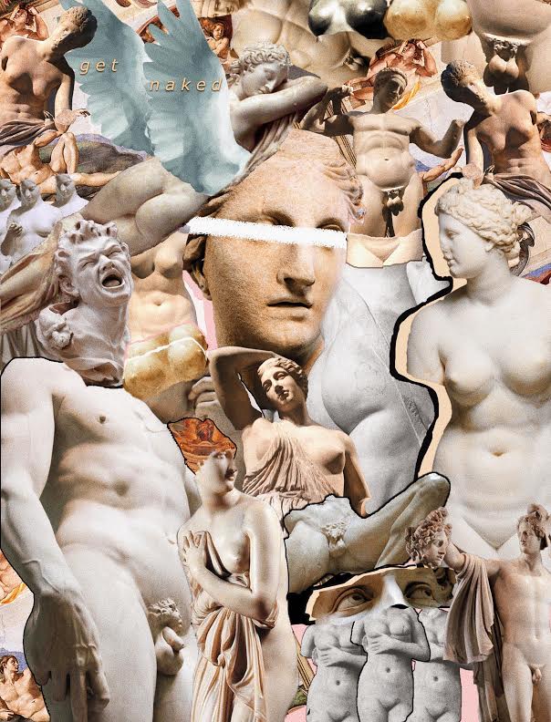
For my project I chose to create a collage of various sculptures in the nude. In my collage, you can see the differences in the depictions of male genitalia versus the female; one is almost always more detailed than the other. The male’s perfect athletic bodies are also shown and the females’ breasts are visible in all the artworks shown. The differences between the bodies of men and women in sculptures is evident when look at art. The power of art is that we can get a message across just by showing, so rather than using words to compare the difference between Michelangelo’s “David” and a statue of Aphrodite, I chose to juxtapose the numerous female and male statues in a collage as a good way to look into this.
Pedagogy and Power
The banking model is a way Paulo Freire the education system. This model shows a student as an empty container being filled with knowledge by their educator. This also lets the teachers put whatever they want into the students regardless of the effect it will have students. It takes away some of the creativity of the students because they have to learn what they are told. I noticed that this has happened to me in some classes that I have taken in high school and even some classes now. Some of my professors have all the answers to the question in textbooks and if we have a question they tell us the answers are in the textbooks when we have test the questions come right out of the textbook so it feels similar to the banking model. This might be good because it allows students to learn a lot of information quickly and they could try to apply it to their own work.
Extra Credit
For my extra credit assignment I attended an art related event on campus. The event was located in the Brooklyn College Library near the front entrance hosted by Dr. Jean Eddy Saint Paul the founding director of CUNY Haitian Studies Institute and Professor of Sociology. The art exhibit was called Beyond Vertieres which contained art works because of French historiography and the history of Haitians. The art works were based on the events that happened during the Battle of Vertieres on November 18, 1803 between the Indigenous Army of Saint Domingue (Haiti) and the French Expeditionary Army of Napoleon Bonaparte. The Battle of Vetrieres resulted in the Haitians defeating the French because they fought for their freedom and would not allow white supremacy to take over the black race. The Haitian people were determined to fight for what was right and would not have their freedom taken away from them. They were unflinching, undaunted, and united to abolish slavery and challenge the French, through their self-sacrifice and tenacity they fought for the respect for human dignity and a decolonial racial justice.
In the beginning of the exhibit it asks “Why, even today, after 215 years, are Haitian citizens unable to access a dignified life?” and “What are we to do beyond Vertieres?” The exhibit then explains and invites the viewer “to re-appropriate/ embrace the core values of freedom, justice, and equality that made Vertieres possible in order to rethink a new system compatible to an emancipated citizenship” The exhibit then expresses through all the art works that represent freedom and the struggles of the battle. The first two pieces was the Pourqoui Vertieres and L’enfant Restavek: Pourquoi Vertieres by Tara Boirad which was created in 2018, it was an acrylic of a small child in each of the art works. In the Pourqoui Vertieres it was a little boy and in L’enfant Restavek: Pourquoi Vertieres it was a little girl both of them seem to have a blank expression and the artworks were both close up images of their faces in black and white. In the next three pieces created by Patricia Brintle were Catherine Flon (2011), Defille la folle (2008), and Marie Jeanne Lamartiniere (2012), in the three pieces it depicted hard working women transitioning from sewing clothes and washing it to holding up a flag and in the midst of battle, there was more color and you could see the contrast in the colors form bright to dark, the colors in each of the works were similar but used in different places.
There were many works of art shown in the exhibit which showed and represented the Haitian culture traditions and their struggles. Their struggles and stakes have been conveyed through these artworks by showing what they had to risk for the sake of freedom and it showed the importance of remembering the history of the Battle of Vertieres and what all those men and women fought for by putting their lives on the line. The event contained many wonderful pieces and works of art, from abstract pieces to spiritual and human expression, overall I enjoyed the exhibit and would like to stop by the library to see all of the art works again.


Final Project
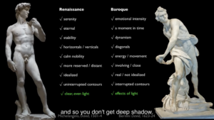
The Differences Between Renaissance and Baroque Art
Renaissance and baroque art are often viewed as similar. This could be because both eras were good at using realism and according to Renaissance Art vs. Baroque Art: Understanding the Difference by lee down “Both styles use vivid, evocative pigments, and, what is perhaps most vexing is that, where subject matter is concerned, both eras have strong emphases on topics from the Judeo-Christian Bible or from Greco-Roman mythology.” Another reason why they were sometimes similar is due to the fact that Baroque artist would recreate Renaissance art. Although the art was sometimes similar there are various important differences that make each era unique and help us differentiate them. Here I will be discussing the differences between the two era’s art. For the Final Project I chose to do prompt number three the Creative project. While doing the Met assignment I found myself very interested in the differences between Renaissance and Baroque art that I decided to make my final project thesis on it. I researched both time periods, read and watched videos on how they differed and analyzed various paintings and sculptures as well.
The Renaissance began in the 1400s and ended in the 1600s. It was a very important time period for it brought about many new things and was known as the rebirth. There was a shift of focus to humanism which means there was a greater importance placed on humans rather than divine beings. The Renaissance was also known for its many artists. Like Brunelleschi who founded linear perspective which gave gave depth to 2D art with the use of the Vanishing point. He was also known for creating the dome in architecture. There were various other great artist known from that time such as the famous four Michelangelo, Raphael, Donatello, and Leonardo.
The Baroque era began from in the 1600s and lasted till the 1700s. Around this time the Catholic church was undergoing changes with the Protestant Reformation taking place. As a result the catholic church felt a new way of biblical art was needed in order to keep and counter the Protestant reformation so art became more forceful, emotional and had greater realism. Which was also found in Protestant art and other European countries.
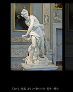
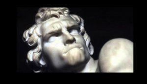
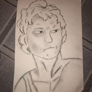
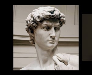
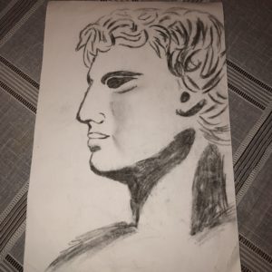
With the focus on perspective and adding depth in Renaissance art the paintings and sculptures would often lack emotion and appeared to be still. Renaissance art focused on stability with pyramid shaped compositions or the use of vertical and straight lines. While Baroque art emphasizes emotion and was known as dramatic. Baroque art used emotional intensity, dynamism, diagonals, was involving, real, interrupted contours, movement and had direct focus. For the creative aspect of the project I recreated two different Davids. One was based on Michelangelo’s David 1501-4 which was from the Renaissance and the other was based on Bernini’s David, 1623-24 from the Baroque era. Although my drawings were based on two different full body sculptures I drew the faces or focused on David’s portrait yet tried to convey the different styles from both periods. In Michelangelo’s sculpture David is more straight and vertical with some contropasto he shows some emotion but it is more eternal as opposed to Bernini’s who looks like it is a moment in time with a look of anger and concentration. Bernini’s David also has diagonals and appears to be moving more dramatic.
Sculptures I based my Drawing on
Renaissance Art

Baroque Art