Unit 2 Summary

The culture of what is called the ‘near east’ had a kind of reverence for the mythical. In that they were much the equivalents of ants from the perspective of personified nature. Much of their art reflected their focus on appeasing the forces of nature. The Babylonian Map of the World was used to represent mythological figures through an approximate mapping of the ‘near east’.

Unlike the ‘near east’, Egypt as a whole is easier to refer to as a singular entity. Egyptian art served the purpose of the mythological: much the same as the cultures of the ‘near east’ (this is my first example). However, their relationship with their divinity–while still stressed–was more personal. Much of their crafts served some ceremonial purpose that most citizens took part in. Most abundant of these crafts being the assortment of funeral ornamentation. Being that divinity and all things spiritual were so interwoven with the Egyptian sense of self: artists were focused more on the abstract–the idea of things (Hard stone group statue of Ramses II with Osiris, Isis, and Horus ).

Greece’s mythology took a humanistic approach. The mythological figures are often some exaggerated expression of human nature. Greece, while having a varying amount of styles in their art, is most prominently known for their focus on realism. The Greeks had greater inspiration in the spirit and potential of humanity: with a fondness for portraying reality as is. While Mycenaean art still took after much of what came before with Egypt ((Kouros) this is my second example): Greece would eventually become synonymous with realism (Doryphoros).

Rome took much of its inspiration from Greece but Roman craftsmen would still appreciate the use of un-detailed figures for the sake of a theme/concept ((Ludovisi Battle Sarcophagus) this is my third example).

All these cultures are super cool. They all have similarities. They also have lots of differences. It all makes me wonder if the united states will be around for something as long as five thousand years. Perhaps I am looking at it wrong: an America of a different name will exist.

It truly makes me wonder in awe at the kind of time and effort it took to build such constructs as the pyramids. The Colosseum is also such a huge undertaking. Christianity apparently took of real huge by the time Rome was a shambling corpse. Christianity is a huge religion; religion is huge. Makes me wonder how things got so huge in so small a time.

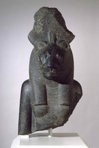
Brooklyn Museum

The bust of the Goddess Sakhmet was gosh-darned cool.Color: Seems to be comprised of some black stone. The particular luster it may have once had is likely not what the rustic remains portray.
Line(?): There are plenty of etchings on the bust to indicate the appearal worn by sakhmet. The bust seems to have been going for a general impression of the human body rather a realistic approach: perhaps implying simplicity for the sake of mass production or perhaps to keep Sakhmet from looking relatable.
Scale: The scale of the bust seems to be a good fit for a an ornament: meant to evoke the thought of Sakhmet but not as a center piece.
Sakhmet’s head is feline in appearance; I imagine this has something to do with Egypt’s culture. A lot of cats–a lot of felines.
Sakhmet is the daughter of the sun-god Re, taking on the role of ”The Eye of Re”: destroying the enemies of Egypt abroad. That is why I chose this work specifically: it was cool and I need a piece.
There is a big disk crowning the bust. Only a bottom portion of the disk remains. I would go so far as to say that perhaps the large disk crowning the ‘Eye of The Sun’ might perhaps just maybe be a representation of the sun
The patterns could represent ritual appearal. The face seems to be expressionless. The disk may have been used to tell the time–though that really is stretching too far.


In the Soul of a Nation collection I chose ‘The United States of Attica’ by Faith RInggold to write about on this blog. It is a very powerful image.
Map is split into four quadrants, with the colors being inverted through a reflection in the x-axis. I suppose the this is to reflect the information written in each quadrant. This could also just be aestheticly pleasing; it is aestheticly pleasing but I mean only for that reason and not to reflect the information.
Since this is mapping out injustices suffered throughout America: I would imagine that RInggold had wanted to use the north American continent for the map–and she did.
RInggold created the map in tribute to the men who died in the police raid on the prisoner’s rebellion in Attica, New York. A revolt had occured regarding the conditions the prisoners had to suffer through. She must have felt that this incident would be thematically appropriate to bring together all the evil of the world–and relevant too. Hence the name ‘The United States of Attica.
It seems that the colors are in reference to a popular black nationalist flag from the 60s. Appropriate considering the context.
The fact that it is a map rather than a collection of clippings containing articles and texts about these events is a part of the appeal. The fact that it is in the form of a map gives the events that RInggold had listed a lot more impact and wieght behind their reality.

Unit Summary

The banking model is as Paulo Freire puts it is meant to simplify the communication of knowledge considered to be mandatory by the state to the developing population of children. Considering the book’s contents: it is simple to say that Paulo Freire saw this mode of education as an insufficient one. Not being a ‘proper’ education. It empower figures of authority in the students’ minds. The students become complacent with the role of receiver and so-on.

The purely visual aspect of art can be broken down into neat categories using formal analysis. That is pretty neat if I do say so myself; I have indeed said the previous sentence. The banking model of education seems to be the most simple to implement as opposed to any concentrated effort put into each student. It really does seem that way. When I say ‘that way’ I of course refer to the previous sentence. There is a lot of context behind just about every choice made in the visual arts. Context is very important. The materials used in a sculpture is indicative of what the crafts-person had access to. The mole-men despise those who would yearn for more. The banking model of education isn’t necessarily malevolent even if weak. I sure did learn something about artwork and it is all so very close to my heart. Much like the mole-men: I will always return to all of this throughout my life. I’m not sure what the banking model of education has to do with CUNY’s pathways common core–but I’m sure there is something.

Formal Concept Analysis (FCA)

Formal analysis is a convenient catalog of the methodology used to analyze and define art solely based on a work’s inherent qualities. ‘Inherent qualities’ meaning: the creator’s intentions aside, what can be determined about some work of art (primarily visual pieces) from that work. Among the catalog of methodology are–in no particular order–the use (and absence) of color; the solidity of the lines and framework; the conveyance of three-dimensional space or lack thereof; the scale of the visuals.

My Art Story

Art is a person’s visualization of reality. Whether in the form of writing, drawing, crafting, and casting, it is always to represent an idea–a concept. The idea can be ‘how do I make this look cool’, ‘what would be effective in marketing this product’, ‘how do I capture the essence of some emotion/experience/concept using written word/clothing/physical crafts/instrumentation’, and so-on and so-forth. The concept behind creation does not have to be lofty or complex. The absence of reasoning itself is considered art at times.

Neither is art confined by its more familiar forms. Art is an all-encompassing term that is difficult to define; we have forms of art that–being  most prevalent and familiar– that we use in lieu of a definition. The essence that distinguishes art is designing–destining. That’s not to say the presence of a design indicates art: choosing whether an exit sign should be red or green–while a design choice–is not art. Determining the layout of a hotel and the resulting aesthetics is far more applicable. For this blog: it is sufficient to define art as something with design and that design having a certain level of complexity.

Even more trying is justifying the creation of art. Everybody can appreciate a good piece (‘piece’ being whatever you want it to be) but art is often seen as indulgent. Art is a necessity. The creation of art is a catharsis for both the creator and the ones who consume the art: a form of communication and validation through simply knowing and experiencing the same thing. We create and use art to better understand the reality we live and experience (‘reality’ being a placeholder term for just about anything, physical phenomena notwithstanding).

I want to learn everything this class is advertising.


How To Post (Assuming You Have An Account Ready)

  1.  As soon as you enter ( art1010shawfall18.commons.gc.cuny.edu ), click on the     ‘+ New’ button at the top
  2.  Move you cursor down to ‘Post’ and click on it
  3.  Enter your text into the large empty box
  4. Enter your title in the small thin box above
  5. Tag your post properly using the ‘Tags’ column on the right side
  6. Check the correct class on the ‘Categories’ Column to the right
  7. Click on the ‘Publish’ button to the right