Met Museum Visit

This painting is titled, “Saint John on Patmos” painted by the artist Hans Baldung circa 1511. It depicts Saint John living in exile having a vision of the Virgin as he is writing his Book of Revelation. Originally, this piece was one third of a triptych joined by two other paintings. This painting is a good example of a Renaissance piece of art is it shows the lighter, more approachable side to Christianity. Many paintings before this time had gruesome depictions of Christ on the Cross or other grizzly or unsettling images. The Renaissance paintings, specifically this one, switched up the approach to depicting Christianity, partially because it relies on iconography with the Virgin appearing in the clouds. A heavily recognized and celebrated image within the religion.


This painting is titled, “The Rape of Tamar” by the artist Eustache Le Suere circa 1640. The painting depicts Tamar being raped by her half-brother Amnon. This is a good example of a Baroque painting because it highlights a scene of drama. It illustrates the action right before a dramatic event occurs. It also utilizes the diagonal plane in both the bodies of Tamar and Amnon. The use of light is also being played with by the artist specifically on the upper left side of the painting where there is a shadow cast on the pillars. When looking at this painting it is hard to be neutral or ambivalent, another sign of a Baroque painting, as most paintings from this time force their viewer to take a stand.


MET Museum Visit

Upon visiting the MET as a school assignment, I decided to make it a solo day trip adventure. I went on a Friday afternoon, which evidently became the busiest point in time I’ve ever seen a museum! I guess that’s what there is to do on such cold days, nonetheless it was really fun. I sat down by the Temple of Dendur in the Sackler Wing, which had a beautiful fountain/pond that I was able to plan the rest of my visit by. I made my way to the European Art section to complete this assignment.

There, I found numerous pieces of art work representing the year 1250 – 1800 and more specifically, the Renaissance and Baroque art periods. The difference between the two art forms is essentially their time period and their level of influence to the world. Renaissance art from the 15th and 16th century contain much about science, philosophy, literature, and education. Baroque art otherwise evoked more dramatic emotion and was to be able to reach even “the most illiterate” of the communities.

This first piece titled Madonna and Child with Saints Catherine of Alexandria, Leonard, Augustine, and Apolloni by Girolamo dai Libri is a great initial representation of Renaissance art. It’s origin alone, Verona, Italy, made in the 15th century is your first indicator. It was painted for the Augustinian church of San Leonardo, an altarpiece. The juxtaposition of the lively tree and the dead one beside it represent Death and Resurrection – key themes in Renaissance art. Renaissance art is very large on liveliness, rebirth, education, teaching, philosophy and beyond. This piece is a good representation of these themes.

A good representation of Baroque time period is a dramatic hunting scene called A Forest at Dawn with a Deer Hunt created by Peter Paul Rubens. There are three aspects in which “hunting” is represented by: light vs. dark, growth vs. decay and life vs. death.


met museum visit

I went on a Friday (bad idea)

Gerard David (Netherlandish, Oudewater ca. 1455–1523 Bruges) 1506

Said to be view from below to give the focus to more ethereal concepts. Being from the Renaissance it has a center of focus. it rely on the given information of the time to convey the center  ideas considering that these pieces are multi-storied polyptych they are concept dedicated to each frame to tell a story throughtout


Guercino (Giovanni Francesco Barbieri) (Italian, Cento 1591–1666 Bologna)

This painting is from the Biblical book of Judges. Delilah, and is set upon by the Philistines, who bind him and blind him. Baroque art is more angled some more extreme than others this piece is angle diagonally to the right side. it work with the style of the time period to enhance the overall motion that the piece its trying to convey being tugged to the left side.


The Met Museum Visit

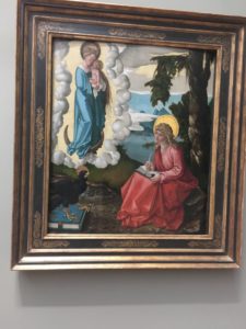
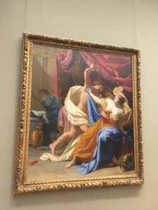
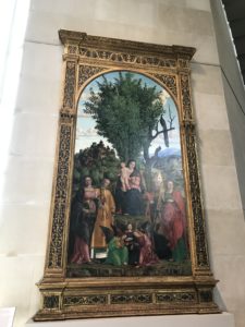
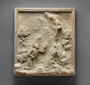
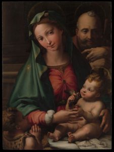
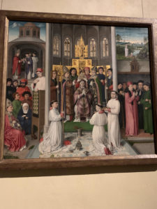
My visit to the Met was very pleasing as usual. I went on a Saturday so it was very packed with New Yorkers and tourists alike. This was actually my third time visiting as I had already gone once in high school and once just last semester. It is easy to notice however, that not even three visits are not enough to view the vast amount of works and exhibits available. The themes, styles, and subjects that the artwork and galleries represent are very large. In many works, I noticed elements and styles of the Renaissance and Baroque.

The Renaissance and the artwork attributed to it occurred during the 15th and 16th century. Generally, these types of works include elements such as calmness and serenity, uninterrupted contours, stability, and even lighting. They also tend to be idealized, and idealize whatever subject the art is portraying. One example of Renaissance art at the Met was Venus and Cupid by Lorenzo Lotto. The artwork is a nude painting that portrays the goddess Venus, along with her son, Cupid. The immediate theme given off is that of love, given the fact that it portrays a mother and her son, which shows the bond of love between them. Additionally, the background is compromised by a total red, which is also a color used to represent love. The features of Renaissance artwork is evident in this painting because the contours and hues used remain stable throughout the whole painting. Despite there being darker colors such as blue for the towel, and lighter colors such as white for the color of their skin, both colors appear to have a similar brightness to them. Furthermore, the lighting of the painting creates a feeling of calmness, while the subject itself creates an idealized scene of an idealized woman.

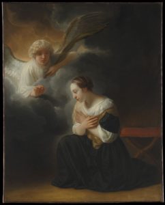
Artwork attributed to the Baroque is primarily introduced in the 17th century. This type of artwork is opposite of the Renaissance, and includes emotion, intensity, and drama. Lighting in these works fluctuates more, the artwork can be described as unstable, and it intends on capturing a moment in time. One example of Baroque art at the Met was Moses Shown the Promised Land by Benjamin West. The first thing I noticed in this painting was the contrasting light. Baroque art is all about energy and the energy given off by differing light and this painting is a perfect example. The top center of the painting shows a bright light opening up in the clouds that is supposed to represent the “promised land,” or Heaven. The right side of the painting is very bright compared to the left side of the painting. On the right, we see an angel who appears to be showing Moses the light from Heaven. Despite the far right consisting of darker colors, the lighting itself is still very bright. On the left side, we see Moses next to a very dark cloud that encompasses the majority of the left side. The colors used here and the lighting are very dark. Lighting is a major key that differentiates Baroque and Renaissance art. While Renaissance art has very smooth and consistent lighting, Baroque art encompasses a wide spectrum of lighting from the darkest darks, to the lightest lights.

Blog Post #10: The Met Visit

The Metropolitan Museum is one of the largest museums in the world with an encyclopedic amount of art inside. When going through the museum’s Renaissance and Baroque paintings, some were very intriguing and made me very interested. So, here’s some of the art that I looked at.

The Renaissance sculpture of Saint Jerome in the Wilderness done by Antonio Rossellino in 1470s, which can be seen in The Met Fifth Avenue in Gallery 500. It was breath taking that I couldn’t resist looking at it. First off, the way that everything pops out as well as the border on the sculpture makes it seem like a 3D image. Even though it is done in one color (Tan), you can tell what everything is. Also, the marble that is used to make it gives it a glossy texture when seen in real life. 

The Baroque artwork of Wentworth House Made in American during the late 1690s, can be seen in The Met Fifth Avenue in Gallery 711. The artwork is made with Oak and Pine Wood which made the artwork seem more rustic. The colors are very tame either than that green chair which pop out. The tone of the picture seems dark and the size isn’t too big.

The big difference I see in these two artworks and throughout all of Renaissance and Baroque art is what is being painted. Where the Renaissance seems to be going back to the old ages where people paint gods and allusions to holiness, Baroque art is more towards the Greek humanism standpoint where it is more involving man and his things.

The Metropolitan Museum of Art

During my visit to the Metropolitan Museum of Art it was a confusing experience and the exhibits were enjoyable. At the Metropolitan Museum there were so many lines of people, tourists, and crowds everywhere getting lost, looking at art works, and taking photos. The Metropolitan Museum was a different experience for me compared to the Brooklyn Museum. At the Brooklyn Museum there weren’t as many people every where compared to the Metropolitan, also things at the Brooklyn Museum were easier to find compared to the Metropolitan. At the Metropolitan Museum of Art I had to constantly rely on a map or ask someone that worked at the Metropolitan for directions on where specific pieces of art would be located. However, the overall experience was great and I wouldn’t mind going back but they should try to come up with a better system for people instead of people constantly crowding at the help desks.

Caravaggio (Michelangelo Merisi)- The Denial of Saint Peter 1610

Pompeo Batoni- Diana and Cupid 1761

The 16th century “The Denial of Saint Peter” 1610 by Caravaggio which is Renaissance art and the 17th century “Diana and Cupid” 1761 by Pompeo Batoni which is Baroque art share many similarities and differences. They are similar in ways such as being paintings from Italian artists, both paintings are oil on canvas and the eras are very close. However, they have many differences such as the different centuries that they were painted and the depictions of the subjects from the different artists. Caravaggio painted a more darker background with more light towards the main figures in his painting depicting a woman, a soldier and a man, Peter. In his painting “The Denial of Saint Peter” it is Peter in front of a fire place and the woman and the soldier is accusing him of being a follower of Jesus. In Pompeo Batoni’s painting it depicts a natural lighting, there is nature in the background, and it shows trees, dogs, a woman, and cupid. In his painting it is the Roman countryside showing the goddess of the hunt holding the cupids bow away from him. Both paintings highlight the differences between the Renaissance and Baroque era by showing the differences in painting styles, color contrast, shadows, and the way it depicts the emotion of the subjects in the paintings.

Metropolitan Museum Visit

First off, the Met museum is incredibly huge and I really liked the display of artwork inside.I liked is that it makes you feel as if you’re apart of the time period that you’re looking at. On the down side it was so big, I sort of feared getting lost. It was a tad bit overwhelming.

I’m going to be comparing the renaissance artwork, Virgin and Child with Four Angels,Virgin and Child with Four Angels, Gerard David (Netherlandish, Oudewater ca. 1455–1523 Bruges), Oil on woodand the Baroque artwork, Virgin and Child.Virgin and Child, Bartolomé Estebán Murillo (Spanish, Seville 1617–1682 Seville), Oil on canvas

I chose these two because they seemed the most similar in style but they are both different in small ways. First off, the timings of production of both paintings are different. If a painting was made in the 15th to 16th century then it was a renaissance artwork. If a painting is made during the late 16th to 17th century then it was a baroque artwork. Both Renaissance and baroque emphasize religion and can put a lot of importance on women. Both artworks I chose is based on a virgin woman. Another difference is that Renaissance artworks did not completely depict human emotion, while Baroque art focused more on showing them.
As you can see, the Virgin and Child with Four Angels painting give more emphasis to religion with the addition of angels while the Virgin and Child painting is more simple and gives importance to the main feature of the painting.

Blog Post 10: Met Museum Visit

The Met Museum is always quite the experience when you go. I actually went to the Met earlier this year, a little bit after the Met Gala and it was so stunning. Visiting the Met again, I got the same feeling especially because of the holidays and their decorations. I will say that I went during a busy time, so it was more difficult to navigate and fully enjoy, but it was all in all another good experience

For my Renaissance piece  I chose The Holy Family with the Infant Saint John the Baptist by Perino del Vaga. I chose to use this painting because I believe that it shows a lot of what Renaissance paintings embody. This picture shows the viewer a sense of serenity through the colors used and the light emotions on the faces. The painting also uses vertical and horizontal view points that are resembled throughout Renaissance artworks. In this painting, as a viewer, your eyes are drawn into the center of the painting, but then subtly brought in a vertical and horizontal point of view to see the clothes child and older man in the painting.

For the Baroque work of art I chose The Annunciation of the Death of the Virgin by Samuel van Hoogerstraten. This painting really caught my attention because of the light contrast that is very evident, and the lighting effects that can be seen are actually a characteristic of Baroque pieces. Another characteristic that this piece shows is the effects of directed focus which is demonstrated by the use of lighting. There is a deep contrast between the dark background and the center of the painting, which causes some of the center to be the focus of the painting. This painting also uses diagonals where your eyes are brought to the angel in the upper left corner and then down to the virgin in the right corner, making a diagonal perspective. Lastly, emotions can be clearly seen through the body language of the Virgin, in which seems in despair but also content; there is no harsh or dramatic emotion of sadness for death.

Met Visit

Master of Saint Augustine 1490
Saint Jerome as Scholar 1610

The first painting is called “Master of Saint Augustine”. It shows a congregation of people around a powerful Christian figure( I think the pope). This image has very strong colors. The painter uses lighting to show show and focus everyone eyes into the the center, which hosts the Saint Augustine. Not only does the human eye naturally focus to the middle, but also the painting tricks our mind to see space as well. We can draw a 3D image in our head about how the real scene took place. The gold in the painting around Augustine shows how much of a heavenly figure he is. It makes him look above the average human.  A being of all righteousness. The second painting is a painting of Saint Jerome. It also has strong colors. Again lighting is used to direct the people at his face. With Saint Jerome reads a book it shows that he was intelligent because most people could never read. They highlight the differences between the Renaissance the the Baroque because they focus on 2 different topics. The baroque art depicts a religious focused painting, showing that in those times they were focused on religious righteousness. However, Saint Jerome is a good representation of the Renaissance because it showed how people were more focused on education.

Blog Post 10: Met Museum Trip

The Rest on the Flight into Egypt by Gerard David
Samson Captured by the Philistines by Guercino


During my trip to the museum, I was overwhelmed by how big it was. It was very beautiful, although I have never felt good in large areas, since I’m always afraid of getting lost. I enjoyed it a lot, and it will always be memorable to me.

While I was there, I noticed some stark difference between the Renaissance and Baroque art. While both of them have an emphasis on naturalism in the human figure and a value of humanism, they portray this in different ways. Gerald David’s work, “The Rest on the Flight into Egypt” is very serene. The blues and greens of the artwork contribute to this serenity. It feels very stable, as though nothing bad could happen. Nothing in this shot indicates that it will end anytime soon. Mary has a calm nobility to her, as does the Baby, Jesus, which is actually odd, if one takes into account that He should not know how to regulate His emotions yet. This scene even seems more distant than it perhaps should.

On the contrast, Guercino’s “Samson Captured by the Philistines” is not serene in any way. The emotions spike upon looking at this one, by contrast to the other one. You can almost picture how the moment would continue to play out, were it to be ‘unfrozen’ from this ‘snapshot.’ It looks very unstable, and there is so much motion frozen in this painting. If you stare at it long enough, it almost seems to come to life and it makes you want to back away, so that no one will fall on you during the commotion.

Furthermore, while David’s work has one clear light across the entire scene, Guercino’s work has highlights on certain parts that draw your eye towards that instead of what is in the shadows.  Also, while in David’s work, the faces of the Virgin and Child are both idealized to look perfect and flawless, Guercino’s work has people with specified faces that are imperfect and very human. There is even a man in the background of “Samson Captured by the Philistines” whose beard is graying, a sign of reality, not an idealized utopia. These differences in the works of art are characteristic of difference among ALL works of art between the Renaissance and the Baroque time periods.

Renaissance vs. Baroque- MET Museum Visit

My experience at the MET museum was different than when I went to the Brooklyn Museum. The outside of the MET and was more striking. I was intrigued when I got there because of the size of it and the nice touch of the sprinklers outside. There was a lot of people there sitting on the famous steps and chit chatting. I was surprised by how packed it was on a Wednesday around 3 PM. I went with my cousin who also needed to go for one of her classes. They have a nice amount of cool exhibits, such as the jewelry exhibition, and galleries to check out from different eras.


The two artworks that stuck out to me were the Portrait of a Woman by: Giovanni di Franco from the 15th century (image on the top) & another by: Giovanni Battista Gaulli from the 17th century (image on the bottom). Generally, Baroque art is more dramatic and emotional than Renaissance art. The similarities between these two art pieces is that a woman is the center and focus and that’s why I chose it. I wanted to choose two artworks that had some sort of similarity. The first portrait of a woman has a more serious face, while the other has a little smirk, showing more emotion. The woman in the Baroque art piece has jewelry on her silk dress and she’s wearing earrings. On the other hand, the portrait of the woman in the renaissance art piece has a more plain dress on and isn’t wearing jewelry. Another thing to point out is that the woman in the Baroque artwork has more of a real-life skin tone, making it look like it’s a picture taken from a phone. The colors used in the Baroque art piece are more brighter compared to the Renaissance art piece. Overall, the main difference between the Renaissance and Baroque is that Baroque art has a more dramatic vibe to it and it is more striking at first glance.