The Renaissance and Baroque Art.

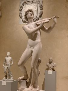
This sculpture is a depiction of Orpheus, known for being a famous musician and poet in Greek mythology, playing the violin. At the immediate eye view, one notices that the Bronze statue is very big in size- especially when seen in relativity to the other statues around it. The large scale of the statue helps catch one’s eyes and stand out amongst the others. Although it’s one solid color throughout, there are many details that bring the statue to life and give it a unique character, From the way the hind leg is positioned to be bent and elevated in relation to the front leg, to the way he’s playing the violin on the other side of his body as he looks upward not only makes it seem human-like, but it gives it almost this grace in it’s expression. The loss in stiffness, helps remind the readers, aside from the violin, that he’s an artist. This is an example of Renaissance art because there’s a lot of more flow in expression that help attribute to this overall involvement of art and even “rebirth”, which is what the Renaissance was all about.

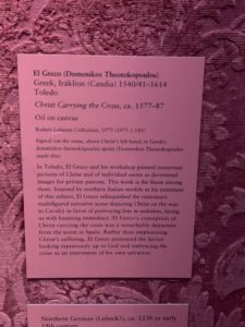
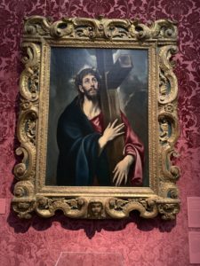
This painting is an image of Christ, carrying the cross. Christ being a very important and symbolic figure with significant Religious meanings, globally. In the painting, Christ is holding the cross very firmly with both hands (and as we know in Baroque Art there was the common presence of religion in the art) which can be interpreted as holding onto religion, as it wasn’t something fully accepted at the time. The colors, navy blue and a red that has rose highlights creating a silk looking material, are highly contrasted among the background of dark clouds, as is the Brown cross with white detailing creating a wooden appearing surface. Again, bringing attention to Christ and the cross, symbols of religion. Lastly, Christ himself is looking up to the sky and often this is a symbol or gesture done for hope, one done when in desperate needs, at that. With another symbol of hope this may reveal how hope and religion went hand in hand, and therefore baroque art was used not only to create dramatic, emotional art, but also to coincide with the more political side of things which involved religion.


While both Baroque and Renaissance art have had significant impacts in expression during their time periods, both were very different in how they manifested in art. Renaissance art included more Humanism, Realism, Greek/Roman art forms, linear perspectives, architecture, music, and much more. Baroque art, on the other hand involved more color, more dramatic scenes, details, to “create a sense of awe” for the audience, with intentions to “appeal to emotion”, and etc. They are both significant because they help show the difference in focuses and ideologies that Art helped carry throughout each of these specific time periods.

Blog Post 10: Met Museum Visit

The Met Museum is always quite the experience when you go. I actually went to the Met earlier this year, a little bit after the Met Gala and it was so stunning. Visiting the Met again, I got the same feeling especially because of the holidays and their decorations. I will say that I went during a busy time, so it was more difficult to navigate and fully enjoy, but it was all in all another good experience

For my Renaissance piece  I chose The Holy Family with the Infant Saint John the Baptist by Perino del Vaga. I chose to use this painting because I believe that it shows a lot of what Renaissance paintings embody. This picture shows the viewer a sense of serenity through the colors used and the light emotions on the faces. The painting also uses vertical and horizontal view points that are resembled throughout Renaissance artworks. In this painting, as a viewer, your eyes are drawn into the center of the painting, but then subtly brought in a vertical and horizontal point of view to see the clothes child and older man in the painting.

For the Baroque work of art I chose The Annunciation of the Death of the Virgin by Samuel van Hoogerstraten. This painting really caught my attention because of the light contrast that is very evident, and the lighting effects that can be seen are actually a characteristic of Baroque pieces. Another characteristic that this piece shows is the effects of directed focus which is demonstrated by the use of lighting. There is a deep contrast between the dark background and the center of the painting, which causes some of the center to be the focus of the painting. This painting also uses diagonals where your eyes are brought to the angel in the upper left corner and then down to the virgin in the right corner, making a diagonal perspective. Lastly, emotions can be clearly seen through the body language of the Virgin, in which seems in despair but also content; there is no harsh or dramatic emotion of sadness for death.

Met Visit

Master of Saint Augustine 1490
Saint Jerome as Scholar 1610

The first painting is called “Master of Saint Augustine”. It shows a congregation of people around a powerful Christian figure( I think the pope). This image has very strong colors. The painter uses lighting to show show and focus everyone eyes into the the center, which hosts the Saint Augustine. Not only does the human eye naturally focus to the middle, but also the painting tricks our mind to see space as well. We can draw a 3D image in our head about how the real scene took place. The gold in the painting around Augustine shows how much of a heavenly figure he is. It makes him look above the average human.  A being of all righteousness. The second painting is a painting of Saint Jerome. It also has strong colors. Again lighting is used to direct the people at his face. With Saint Jerome reads a book it shows that he was intelligent because most people could never read. They highlight the differences between the Renaissance the the Baroque because they focus on 2 different topics. The baroque art depicts a religious focused painting, showing that in those times they were focused on religious righteousness. However, Saint Jerome is a good representation of the Renaissance because it showed how people were more focused on education.

Metropolitan Museum of Art Project

    I got to the museum after a 30 min walk and had to go through the usually trouble of getting the ticket, which is waiting among a mass of tourists. It’s pretty clear that many museum goers are not New Yorkers. I have been to the Met many times in my childhood, but I really never cared for it because the museum is not relevant to my life. This apply to the present me because I don’t have any personal reasons to go the museum unless it is for an assignment. I’ll skip all the things in between and get to the exhibit. I walk through the door, and I am greeted by a large room with paintings. Being very familiar with this scene, I start looking for art pieces to use. I can obviously see the skilled artistry behind these paintings. They are beautifully painted and show dedication to the arts. But at the same time, I am annoyed by the amount of tourist here. It makes me want to leave as quickly as possible. Even with the large amount of paintings here, I have trouble see the painting unless I walk past the crowds of people here in this large room. But when I think about it, the museum really has a lot of these old historical and influential painting; I realize that many tourist come here because if this. Some of these may be from the where the painting was painted and have never seen it. I find my two pieces and start typing on a bench. In the middle of the many rooms in the gallery. I choose Joos van Cleve, The Crucifixion with Saints and a Donor from 1520 for renaissance art. Charles Joseph Natoire, The Rebuke of Adam and Eve from 1740 for Baroque art.


The Crucifixion with Saints and a Donor is an altarpiece made in the 1520. It depicts a group of people at the site where Jesus Christ was crucified on a cross. My eyes first focus on Christ himself and then I notice the masterful depictions of greenery in the background. Hills and rock formations covered in grass looks beautiful in the building. Then I notice the people at the feet of Christ. The ones to the far left and right seem uncaring and not really in pain. The ones in the middle are however interacting with Christ’s dead body. A nun is praying, a man is setting the cross, a women seems distressed, a priest is on his knees praying. This scene represents humans in a very calm state of mind, showing the mental strength of human beings. It also has people seemingly having individual thoughts on the situation, showing individualism. These traits reflect humanist values.

The Rebuke of Adam and Eve from 1740 show Adam and Eve begging for forgiveness for eating the golden fruit of the tree and God accompanied by angels looks furious and with a finger pointed up, looks ready to curse the pair. The first thing I recognize is the somewhat exaggerated poses of the characters compared to the altarpiece. These poses tell a clear story of drama due to the eating of the forbidden fruit. I also see the clear contrast of light and dark to create a dramatic tone. This is seen from the light that God is surrounded by versus the real world that had greenery from the trees and plants that are darker in comparison. These are typical traits of baroque art.

The MET experience

This was my first visit to the MET Museum, after living in New York for over fourteen years. The experience as a whole was very overwhelming as there was so much detail to take in from the architecture of the building to the carefully displayed art pieces. The place was filled with large numbers of visitors but, the place didn’t feel crowded and most importantly didn’t take away from an observer’s experience. The museum seemed to be divided into different zones according to the setting and time period.

The first artwork that stood out to me from the Renaissance time period was called “The Miraculous Communion of Saint Catherine of Siena”. The artwork as a whole was very overwhelming, since there are so many details that catches the eye. It is a large altar piece and portrays the story of a Sienese mystic and a minister to the poor and plague-stricken. The work shows a divide in the middle in the forma pillar and the two worshipping the Christian Jesus while backs turned. There is so much warmth, mystery and high contrast in the artwork that invites the observer in. There is careful detailing in the Christ and the two people, showing the importance of deity during the Renaissance period.

An artwork that I drew to in the Baroque art section was the “Man Holding a Jug”. It first seemed very whimsical and without purpose, yet something so real that it seemed surreal. The artwork is a portrait of a man holding a jug. Like the renaissance art work, this picture also used a warm color to focus the portrait and showed high contract in the background with a darker color. The face of them man is the highlight of the piece for me because, it look very real and photo shopped. This is drastically different from the Catherine of Siena, since the work was very art-like, and didn’t have a real life portrayal. The faces of the subjects in the renaissance artwork was very dull, and unreal, for a lack of a better word.

The MET museum is definitely a place that pushes observers to critically think with its overwhelming portrayal of distinct works from distinct periods in time. I was able explore outside of these two exhibits, and it was amazing to witness the power of art. I think there is so much history that can be seen by simply looking at a piece of art.

Met Visit

Visiting The Met is probably one of the most visually pleasing things you can do! The Met is huge and it features a bunch of different exhibitions such as “Art of Native America,” “Dangerous Beauty: Medusa in Classical Art,” last but not least, “Japanese Arms and Armor from the collection of Estuko and John Morris.” My favorite part of the museum was the “Dress to Impress” collection. It consisted of so many beautiful and elegant outfits. The colors and the patterns on the outfit were absolutely vivid. You can really tell someone took their time to create these pieces. On the outfits there was detailing on the collar which made it seem like it was handmade. At the Met I looked at some renaissance and baroque pieces of art. The art piece from the renaissance collection that piqued my interest is a footed beaker.  Although it looks like a vase it’s called a beaker. The cultural background that it is imported from is Hungarian, Nagyzeben. The art piece is a medium size art piece (Height: 9 13/16 in. (24.9 cm) that is silver and partially gilded. The art work is made out of metalwork- silver.  
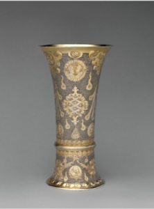
The art work itself looks like its dripping in gold. It has a really cool semi silver finish which contrasts against the gold designs. There is a thick band at the bottom which creates an illusion of two pieces rather than one whole piece.  The Baroque artwork that I picked is a footed beaker with a cover. It was easier to compare two pieces of artwork which were similar in shape and design. It’s originated from Hungarian, Brasso. The artwork is a medium (15 3/4 x 6 11/16 in. (40 x 17 cm) size of gilded-silver, metal-work. The art piece had a dull gold and silver finish to it. This art work has a man in the middle with flowers/leaves around the art piece. The art piece also has a cover to this beaker. The cover has a very shiny finish to give an illusion that it is glistening.  The difference between Renaissance and Baroque art is that most people understand that if a painting or sculpture is made in Europe between 1300 and 1600, it’s likely a Renaissance work. And, if it’s a European work made between 1600 and 1750, then it’s Baroque. … A good word for Renaissance art is “stabilize,” while a good one for the Baroque is “dramatize.”