Posts

Humanism in Greek and Roman Art

Humanism seems to be interested in paying tribute to the form of man. From what I’ve studied it was an ideal/ optimistic philosophy that saw man as rational and capable of making his own decisions without any aid from god(s) or deities. The art tended to focus on the human body and specifically the athleticism or muscles a human could have. After the initial breakthrough of humanistic art in Greek and Roman cultures, humanism would resurface again later during the European Renaissance, becoming a key component of the rebirth.

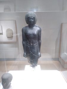
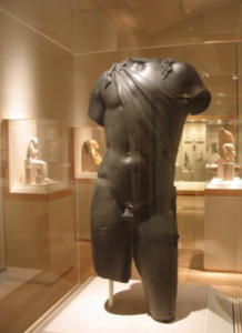
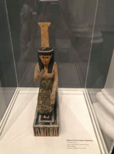
Compared to Egyptian and Mesopotamian art, Greek and Roman art tends to be more interested in the humanistic approach. Egypt and Mesopotamia seems to be focused heavily on paying tribute to gods or deities trying to ensure a peaceful after life, as much of Egyptian culture was based off of preparing for the afterlife. So it would make sense that most of Egyptian art included homage to some god or deity or king who was believed to be a divine ruler. Conversely, Greek and Roman art tended to move away from such tributes or homages and instead wanted to focus on man, and what man can accomplish alone.

For example, lets use the two pictures below:


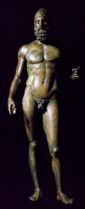
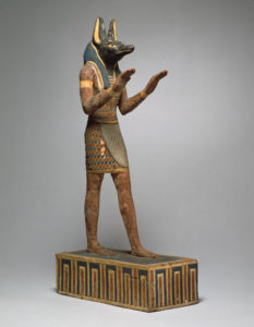
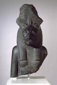
On the left we see a Roman humanist statue. It is titled “man with helmet.” We see a very realistic sculpture of an ordinary man with a helmet. The man’s chest is toned and defined, his arms are muscular as well are his thighs and legs. Even for contemporary standards, this statue is depicting a near perfect human form. On the right we wee an ancient Egyptian statue of Anubis, the god of the dead.  The Egyptians focused their art less on a mimetic depiction of an ideal man, instead paying tribute to a god who they believed would help them achieve a peaceful afterlife. The arms and legs are not particularly muscular or defined and the head is that of a dog. In typical Egyptian fashion Anubis, a god, is not standing directly on the ground, instead he is in an elevated position.

Museum visit 1 & 2

I thought it was really peaceful to walk around the museum and being in one after so long is kinda nice to be able to explore alone and take in the scale of the statues and art pieces.

For the ancient Egyptian part of the project I choose was the Statue of a priest of Amun. what poked my interested was that it was made from diorite not from sand stone, and the details they had to carve into the head structure. The dimension are a bit bigger than what it should be used for thus breaking due to its weight and the brittleness at that scale.The art piece presents the importance of a priest in relation to their Gods which explains the use of the material. On the back side there are hieroglyphics with supposedly the value of the piece or a verse to keep track of hat the statue mean. My question for the statue would be where it would it be placed for all sides to be visible. I would assume there would be like an alter in a center hall for people to view it from all sides

For the soul of a Nation I choose “Did the bear sit next to the tree” by Benny Andrews. the use of solid materials was the thing that allowed some of the ideas to pop out like the flag the should represent freedom for all is being rolled up and how the painted structure of the figure had real cloth and depict this solid object is fighting the American system. Also including the zipper used as a metaphor placing it as a mouth piece and how well it tie together with the themes. the painting was the weakest part and I thought it was to give more color and depth to it.


Brooklyn Museum Assignment

While visiting the Brooklyn Museum, there were many exhibits that struck me as interesting. There were many ancient world pieces from many different time periods as well as beautiful cultures being represented with history. One piece that stood out from me was a relief gallery of King Ashur-nasir-pal II’s palace from the Neo-Assyrian time period. When you walk around, you spot about 12 giant wall panels that once used to reside in his palace. I have attached the image of the one that caught my eye. Titled “Winged Genie Wearing Fancy Bracelets,” it exhibits exactly that. With first glance, you can determine many details of this grand piece of art. It is essentially a large piece of carved out alabaster that gives it it’s 3D shapes and edges. They were all once brightly painted but now exist no colors except a dusty beige tone of the material it’s made out of. The subject is a genie wearing bracelets containing rosettes. With these panels, he intended to show legitimacy to his kingdom and verify his power. These symbols proved that he was in accordance with the gods and these genies are protectors, depicting his great divine power. You can see the three rosettes on the subject’s headband and two wristbands. They show worship to the goddess Ishtar. This panel includes straight alignment and many straight lines of small details such as the curls in the beard and feathers in the wings. It is repetitive and in-line. Furthermore, realistic details are carved out of the genie such as his muscles and even his palm lines. I would estimate the panel to stand about seven feet tall so it seems that the subject is scaled to real life sizing.

Across the center of the piece, you can see scripture embedded into the alabaster. Upon deeper reading, it becomes evident that the scripture is written in cuneiform and the language is in Akkadian. It tells stories about the king’s military victories, rules of his empire and historical context of Kalhu and his palace.

I chose this piece because it seemed surreal that I was standing among such sturdy and lasting pieces of a palace. It had historical context and tells a story among them. I could only imagine what they had looked like in their time with appropriate paint.

A second exhibit that was really interesting was Soul of A Nation. The piece I chose to write about is titled “Shade cord and window”, 1961 by Roy DeCarava. It is a gelatin silver print. What you see in this picture is a single “shade cord” through what looks like a window, and a background of one gray building. The photo is contrasted into two halves, the bottom half being completely black.

With a critical lens and context to the exhibit, I can predict that the image is supposed to reflect Black history. A second meaning behind the shade cord can be that it resembles that of a noose, in the city. Although it can be considered more modern in 1961 (represented through a city building), the noose can symbolize racial division that has been and still is occurring. The window can represent people looking through their window from far away and speculating as it happens, many things.

Through formal analysis, you can determine this is supposed to be a simple, straight forward message. There are 3 colors; black, white and gray and possible mixed in different tones. About half of the image is cut in black so you focus on just the upper half of the photo. The artist could have made whatever you see the whole image but focusing on a smaller zoned in area can be more effective. The single building is in a blurry gray in attempt to show the building is lingering in the far background, more so in the distance while the subject of the piece, the only other thing in black: the shade cord. We exhibit straight lines and an image in gray scale here.

I chose this because it caught my eye as soon as I glanced over. It seemed very simple but the message was empowering as I understood it to be. While recognizing the correct historical significance and context, many vague and simplistic works of art can expand to something greater to the eye.

Greco-Roman vs. Egyptian Art

From what I have learned thus far in my college career and also, my experiences outside of school, I believe humanism to be an idea centered on human beings rather than immortal or supernatural things. In psychology, a humanistic perspective focuses on the client and supporting him or her with a positive input rather than pointing out wrongs. It is an idealistic view that humans are innately good and whatever they do wrong has to be the consequence of situational influences. The most apparent way that humanism is reflected in Greco and Roman art is through the real like human like portrayal of the art. As we discussed in class, the minute details in the movement of the body and face becomes emphasized. For example, hair deviates aways from a standard rigid structure to a more real like with fluidity. They especially emphasizes the athleticism which represents strength, beauty, and an advantage. Even in the portrayal of supernatural divine beings, the Greeks and Romans glorify the physical beauty of the human body. This is drastically different from the Egyptians as they did not fully capture the realistic human body in their portrayal of subjects. They are usually very formalized, static, and less naturalistic. It is clear that they didn’t have a humanistic approach to art in their depictions of deity, who have animal heads and human body.

For example, in a sculpture from the Greco-Roman period titled “Dionysos and Maenad”, the viewers see a portrayal of two women, draped with some cloth. In the sculpture, the artist show realistic movements in the body as well as a real life like connection between the two subjects. Even the clothing are portrayed so naturally. Though the women remain still, they are positioned in a real human like way. In contrast,  the papyrus rolls that depict the weighing of the heart, the observers see stoic, rigid, pillar like beings that are represented as either human beings or deities. They are all created in a standardized method, not giving the subjects any of their individualistic features. Though humanism is apparently present in Greco-Roman art, I think both artwork has correctly captured a time in history that we haven’t seen or heard of. The art speaks of the type of people that lived at the time, and a little bit about their perspectives about the human being.

Brooklyn Museum Assignment

Part 1:

Ancient Egyptian Art

Torso of Dionysos, 2nd- 3rd Century C.E

In this figure of Dionysos he is appeared to us standing with his left arm over on an archaistic female figure identified as Spes, the personification of hope. He is shown wearing a panther skin over his chiton and a cloak wrapped around his upper right arm and shoulder. The panther skin was a great symbol to identify this God just like wine would have been. In order for a support a part of the cloak flows around the back and over the head of the God. This sculpture stuck out to me because it represents the ideal man during that time period. It made me think about the different representations of gender characteristics that are shown through cultures of different eras.  I was also drawn in by the techniques used to make this sculpture look real. The shadowing and the cravings illustrate the hip bone and the abs of the male. The belly button and the crevices around the breast area show an enormous amount of detail. This relates to the material we covered in class because it shows that the human body was exhibited during that period in time. Also the depth of the detail illustrates a mysterious image. The only thing that allows us to differentiate between whether this sculpture is of a male or female is the prostate and breast area. During this period of time human art was highly presented, nude sculptures filled the exhibit of ancient sculptures.

Part 2:

The Flag Is Bleeding

From the Soul of a Nation exhibit I chose to write about, Faith Ringgolds, “American People Series #18: The Flag Is Bleeding” (1967) . This painting is illustrates that the true meaning of the United States flag is not being represented. The meaning of the United States flag is freedom and peace. While in reality especially during the period of time this artwork is representing, there was a high rate of racial segregation and racial discrimination. This piece of artwork shows that we are all equal as humans yet people of color are targeted. This relates to the rest of the exhibit because it shows the discrimination people of color have been surviving over the years. I chose to write about this artwork because the different elements used by the artist allowed me to actually see a clear image. The red streaks running down with the red stripes of the flag display the image of how actual blood runs down. The knife that the African American male is holding represents the hurt and harm that was being afflicted to him during this period in time. The way that all three of the people are locking arms shows that they are equal, yet the African American male is the only one suffering or being harmed. This illustration truly brings the exhibit together and locks in the time period of segregation and racial discrimination. The artist portrayed a clear and descriptive piece, the colors and shadowing of the image bring it to life.

Unit 1 Summary

In Unit 1 of the class, we learned quite a few concepts. Paolo Freire insists on a “Banking Model of education” as a way to criticize the education system. Teachers are those who oppress students and exploit their power. Students are seen as empty vessels, containers even, through the “art of depositing,” we are filled with information. Teachers inherently have this robotic system of depositing and repeating. This cycle, Paolo Friere says is not how it should be. Ideally, there would be more cognition and dialogue exchanged and even a mutual, fair relationship. Cognitive objects should not be held hostage in the oppressors possession.

Additionally, we delved into formal analysis. Formal analysis helps us understand and appreciate works of art as they were intended to be. Through formal analysis, we determine the physical aspects of a piece. We point out the lines, colors and shapes of what we can see. An individual may be able to decide on deeper meanings of the piece through the composition that the artist drew it in. Discussions of it’s historical or mythological context arise as well. With formal analysis, we can categorize works of art together or separate them by what you initially see at first glance or given more time, a more thorough breakdown. We pinpoint all details that are essentially seen at first glance without referring to outside resources.

Through these concepts, I was able to appreciate works of art more. With formal analysis, I can see paintings as more than just a painting. It is more descriptive than that. It can be a red painting with a woman sitting up front as the subject. With the banking model in mind, I am able to more freely depict works of art as I may. Rather, I can imagine a more simple teacher-student relationship from now on.

Brooklyn Museum

The bust of the Goddess Sakhmet was gosh-darned cool.Color: Seems to be comprised of some black stone. The particular luster it may have once had is likely not what the rustic remains portray.
Line(?): There are plenty of etchings on the bust to indicate the appearal worn by sakhmet. The bust seems to have been going for a general impression of the human body rather a realistic approach: perhaps implying simplicity for the sake of mass production or perhaps to keep Sakhmet from looking relatable.
Scale: The scale of the bust seems to be a good fit for a an ornament: meant to evoke the thought of Sakhmet but not as a center piece.
Sakhmet’s head is feline in appearance; I imagine this has something to do with Egypt’s culture. A lot of cats–a lot of felines.
Sakhmet is the daughter of the sun-god Re, taking on the role of ”The Eye of Re”: destroying the enemies of Egypt abroad. That is why I chose this work specifically: it was cool and I need a piece.
There is a big disk crowning the bust. Only a bottom portion of the disk remains. I would go so far as to say that perhaps the large disk crowning the ‘Eye of The Sun’ might perhaps just maybe be a representation of the sun
The patterns could represent ritual appearal. The face seems to be expressionless. The disk may have been used to tell the time–though that really is stretching too far.


In the Soul of a Nation collection I chose ‘The United States of Attica’ by Faith RInggold to write about on this blog. It is a very powerful image.
Map is split into four quadrants, with the colors being inverted through a reflection in the x-axis. I suppose the this is to reflect the information written in each quadrant. This could also just be aestheticly pleasing; it is aestheticly pleasing but I mean only for that reason and not to reflect the information.
Since this is mapping out injustices suffered throughout America: I would imagine that RInggold had wanted to use the north American continent for the map–and she did.
RInggold created the map in tribute to the men who died in the police raid on the prisoner’s rebellion in Attica, New York. A revolt had occured regarding the conditions the prisoners had to suffer through. She must have felt that this incident would be thematically appropriate to bring together all the evil of the world–and relevant too. Hence the name ‘The United States of Attica.
It seems that the colors are in reference to a popular black nationalist flag from the 60s. Appropriate considering the context.
The fact that it is a map rather than a collection of clippings containing articles and texts about these events is a part of the appeal. The fact that it is in the form of a map gives the events that RInggold had listed a lot more impact and wieght behind their reality.

Unit Summary

The banking model is as Paulo Freire puts it is meant to simplify the communication of knowledge considered to be mandatory by the state to the developing population of children. Considering the book’s contents: it is simple to say that Paulo Freire saw this mode of education as an insufficient one. Not being a ‘proper’ education. It empower figures of authority in the students’ minds. The students become complacent with the role of receiver and so-on.

The purely visual aspect of art can be broken down into neat categories using formal analysis. That is pretty neat if I do say so myself; I have indeed said the previous sentence. The banking model of education seems to be the most simple to implement as opposed to any concentrated effort put into each student. It really does seem that way. When I say ‘that way’ I of course refer to the previous sentence. There is a lot of context behind just about every choice made in the visual arts. Context is very important. The materials used in a sculpture is indicative of what the crafts-person had access to. The mole-men despise those who would yearn for more. The banking model of education isn’t necessarily malevolent even if weak. I sure did learn something about artwork and it is all so very close to my heart. Much like the mole-men: I will always return to all of this throughout my life. I’m not sure what the banking model of education has to do with CUNY’s pathways common core–but I’m sure there is something.

Part 1

Figure of Goddess Nephthys, Ca. 664-30 B.C.E. Made in Africa

    This wooden figure represents the Goddess Nephthys. She sits kneeling on a colorful highly decorated rectangular box as a pedestal with her left arm resting on her thigh and her right arm held in front of her face. She has light brown skin, a blue wig, high yellow headdress, and a green garment bound under her exposed breasts.

Some of these colors represents her high status as a goddess. Her blue wig and yellow headdress that is supposed to represent gold symbolizes high status. This is also shown in her highly colorful and and detailed. The colors are red, yellow, blue, and green. The fact that so much color is even on the figure in the first place points to her importance as a goddess.

When we look the figures line, we can see a that this was carved by a skilled craftsmen. The figure has a smooth surface giving it a very recognizable silhouette. Examples are the large headdress Nephthys is wearing and the obvious shaped breasts on her chest.  This figure does not occupy alot of space. The dimensions of the piece is 16 by 7 by 11.5 inches. It seems to have been built to be mobile and placeable within a room.

This figure was definitely own by someone of high status because a figure of this quality would have been very expensive to purchase.  


Part 2

Mars Dust, 1972, By Alma Thomas

    This piece spoke to me because of its size that seemingly traps your gaze. I couldn’t help but be pulled in by the bold colors. I chose this because I immediately saw depth to it. There is a sense of complexity to it even though it looks simple and uniform. The piece relates to the rest of the exhibit because of how Alma Thomas is. She continued to create her art and express herself through it despite racial segregation and gained recognition and success through it all.

There are only three distinct colors utilized in the painting. Red, light blue and dark blue. The simplicity of the colors bring notice to the complexity of the painting. I creates a sense of 3D space. This is because the large splotches of light and dark blue behind the many splotches of red beads make it look like a beaded curtain with an unknown world behind it. And the messy lines that denies clarity is also a factor in its other worldliness.

As I have said in the first paragraph, the size being  69.25 by 57.125 inches creates a trap that steals your eyes. The size makes you want to walk right into it to discover a new world not your own. It looks like a huge portal that harbors the mystery of the world and I appreciate this feeling it portrays to me.

Brooklyn Museum Assignment

Part 1:

The Amunhotep III statuette is located on the 3rd floor of the Brooklyn Museum standing at almost 11 inches tall. The full figure is covered in gold and black, the headwear and bottom garment are golden and the torso as well as the legs being completely black.  The figure is missing arms, probably due to the passage of time, and it is standing on an inscribed wooden base.  The position of the figure is a stride, with his left leg moving forward and his right leg following behind.  The mediums of the statuette are wood, gold leaf, glass, and pigment.  The body, head and base were made of different types of wood. The eyebrows and eyes were made from different types of glass.

The subject of the piece is a pharaoh from the New Kingdom of Egypt: Amunhotep III.  He is one of the first pharaohs to depict himself in a more realistic manner.  The statuette’s stomach isn’t flat, denoting lack of perfect fitness.  His jowls sag slightly, denoting age.

Amunhotep III was the son of Thutmose and his minor wife, Mutemwiya.  During Amunhotep’s reign, Egypt had reached its peak in terms of art production, influence and international power.  Meaning that this depiction of the pharaoh was also a representation of Egypt at one of its most artistic and powerful times.  It is interesting that this is the time when the pharaoh chose to be represented in a more realistic manner, perhaps due to the outside influences that come with being an international power.

Part 2: 

In the Soul of A Nation exhibit, there was a lot that spoke to me due to the fact that not only were there so many beautiful artworks, but because I felt like I was being addressed specifically.  Black artwork in an American setting has always felt like it was a revolution in itself, not always a rebellion, but a constant growth and undefinable spirit of a people that keep evolving, which is why I think the exhibit is perfectly titled.

The piece that I chose is “Black Children Keep Your Spirits Free” by Carolyn Lawrence.  The piece was made through acrylic on canvas and is around 48in x 50in x 5in.  It was completed in 1972.  The 1970s were an important time for Black America because it was the post-Civil Rights Era.  Black heroes had just paved the way for every American citizen to be truly granted equal rights and liberties and because of this, black citizens were making great strides in society.  The phrase “keep your spirits free” is probably a nod to this revolution, and a reminder to never lose the freedom that they had achieved.

The artwork is filled with a wide array of colors.  Orange, yellow, green, red, blue, purple, and pink make up the painting.  The colors blend into one another, different shades of the same colors are touching each other.  In the forefront is a kid making a beat with their hands.  Even though this child is on the right, they are the first thing someone in the audience will see because how large they are drawn, showing they are the closest to us.  Other characters include a kid biking, and a man in a mask playing an instrument.  The words “keep your spirit free” repeat endlessly in different colors all over the artwork.  This is written in different fonts as well, perhaps representing a chant said by many different people.