In my project I did beauty norms throughout history. I decided to do the second choice of the museum tour. This is the link to my presentation.
https://docs.google.com/presentation/d/1qC5gZwqV7uIMmPHjvdkl56nC5YbQ6ajBhMBOHp7hZ8o/edit?usp=sharing
In my project I did beauty norms throughout history. I decided to do the second choice of the museum tour. This is the link to my presentation.
https://docs.google.com/presentation/d/1qC5gZwqV7uIMmPHjvdkl56nC5YbQ6ajBhMBOHp7hZ8o/edit?usp=sharing
“Arrayed in Gold.” Portraits of the Empress Elizabeth of Austria, 20 Aug. 2011, arrayedingold.blogspot.com/2011/08/napoleons-beautiful-enemy-louise-of.html.
Geri Walton. “Ideas of Female Beauty in the 1700 and 1800s.” Geri Walton, 4 Nov. 2016, www.geriwalton.com/ideas-of-female-beauty-in-1700-and-1800s/.
Howard, Jacqueline. “The Ever-Changing ‘Ideal’ of Female Beauty.” CNN, Cable News Network, 9 Mar. 2018, www.cnn.com/2018/03/07/health/body-image-history-of-beauty-explainer-intl/index.html.’
Kunitz, Daniel. “What Art History Can Teach Us about Female Beauty Ideals.” 11 Artworks, Bio & Shows on Artsy, Artsy, 2 Jan. 2017, www.artsy.net/article/artsy-editorial-how-art-has-shaped-female-beauty-ideals-history.
Romm, Sharom. “BEAUTY THROUGH HISTORY.” The Washington Post, WP Company, 27 Jan. 1987, www.washingtonpost.com/archive/lifestyle/wellness/1987/01/27/beauty-through-history/301f7256-0f6b-403e-abec-f36c0a3ec313/?utm_term=.63d6ef6dd351.
“The Art of the Renaissance: In the Line of Beauty.” The Independent, Independent Digital News and Media, 23 Oct. 2011, www.independent.co.uk/arts-entertainment/art/features/the-art-of-the-renaissance-in-the-line-of-beauty-1955030.html.
My experience going to the MET was very interesting and tiring. I decided to go on a Friday night after work since it was the only time I could go. The MET is an hour and half from where I work and on a Friday night the MTA is horrible. One of my best friends decided to go with me, but she was coming home from college. We met up at the city and she had a small luggage, she was tired and cold. I had a long day at work, but was really looking forward to spend time with my best friend at the museum, she was just as excited. When we got off the train station we had to walk and got lost, finally some lady helped us and we got there. We were excited to get there, but as soon as we tried entering they told my friend she could not come in with her small luggage. We did not know what to do because her parents house was in Staten Island and she had no where to leave her luggage. She told me to go in and she would wait outside, and even though that was so nice of her I felt extremely bad since it was freezing.
I went in and had to make my visit short because my friend was waiting for me outside. As soon as I went in I saw many statues like the one we had talked about in class. It was amazing having them so close and I actually enjoyed walking around by myself, even though I felt bad. I tried to see as many things as I could in the hour I had before they closed.
The one painting that called my attention was Judith with the Hand of Holofernes. 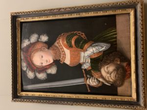 In this painting the women is mostly painted with an orange oil color. However she is described as “dress to killed”. The colors in this painting are darkish and the black background makes the light skin color of this women stand out.
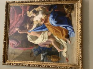
The same of this painting is, The rape of Tamar. In this painting Tamar was raped by her half-brother. It completely differs from the other painting because of the message being illustrated. In this painting Tamar is the victim and is portrayed as weak. However in the other painting the women is painted with confidence. The color in this painting are much more brighter.
Overall going to the MET was great. I just wish I would’ve been there longer.
Thesis: Women’s beauty standards and ideal body types have changed and been showed throughout art.
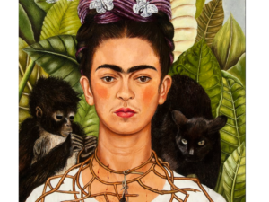
Self-Portrait with Thorn Necklace and Hummingbird by Frida Kahlo
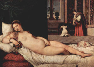
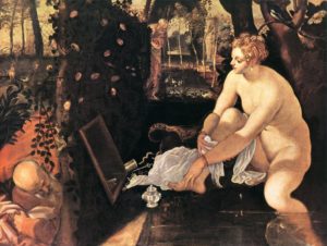

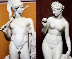
What was consider to be a beautiful women in Egypt and Romans time is no longer what today society considers beautiful. As art develops and changes so does what is consider the beauty of a women.
For some of these images I need to look back into the artist and time period. These pictures all connect because in todays art a lot of it is shown through photography but the women being capture are all similar. They are shown as the beauty of women however it is totally different than older art
Theme: Women have been devalued from Ancient Art, demonstrating how low women are from men.
For the pictures I plan to use I will be using art that demonstrate a hierarchy of men only. I will include art showing humanism because even when regular people were the focus it was just men sculptures and now as much women. I am still looking for other art work.
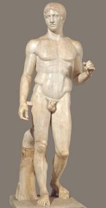
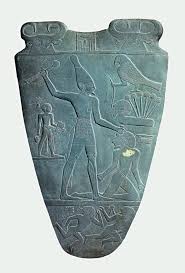
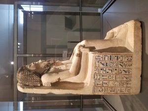
In Unit 2 we discussed the different type of art from the ancient world. The art that comes from Mesopotamia, Egypt, Greece, and early Rome all had their own style of expression, yet had several similarities. The idea of humanism influenced the art of some of the empires such the Greeks. Others based created their art in their beliefs of their God and Goddesses. Through their art they individually expressed what was important and valuable to their societies.
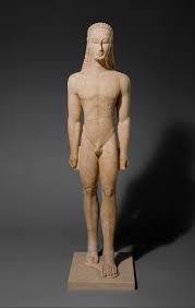
The Greek society showed humanism in their art pieces. Opposed from Egyptian and Mesopotamian artwork, Greek and Romans created 3D art. They believed that man was powerful and equal to the gods so their sculptures showed the full detailed body a man. It was believed that man was the measure of most things. In Greek art nudity was shown a lot. Artist would create sculptures of naked man and it would represent the pride and strength and qualities of human beings, rather than showing someone being a more “powerful” being than man. Two good examples of humanism would be the “Kouros” and the “Doryphoros”. As time went by their artwork began to look more and more realistic. The positions of the sculptures also said a lot about them. Contrapposto, is believed to be the stance of all humans. The tone of muscles, wrinkles, and folds were all shown in a sculptures bodies. Overall, the Greek humanism also showed events going on during that time and they valued free inquiry in that it wanted to open up to new possibilities.
After the fall of the Greek empire the Roman Empire arose. Their art was influenced by the Greeks. They basically copied their art and created their art looked even more realistic. They created their work on marble which gave it a smoother look. The marble made it heavier and unlike the brown material that was lighter.
Founded in the Early Dynastic Period (3100-2686 B.C), Ancient Egypt worshipped their god and goddesses. Their god and goddesses were seen as powerful and respected by everyone, therefore when portrayed in their art they were always bigger than the rest or above. Egyptians did not think that a god should have human like characteristics and so in their art there hierarchy was shown in different ways. As mentioned before usually the god or the goddesses had animal features. They were either at the top of the register and/or created bigger than the rest. The clothing they wore also showed how they were more wealthy and powerful than the rest. The Mesopotamians also based their art work on their gods because they were seen as the highest power. The believed that humans were lower and could not compare to the gods. The artwork of both these societies was created to show the respect and honor they had for their gods.
The artwork from the ancient world varied within the societies. Depending on their values and their beliefs their artwork reflected upon it. The empires all influence each other’s work in one way or another. At one point art was not taken serious because it was believed that it made people misinterpret and think about things that were not even real. The ancient world had a diverse section of art pieces, yet most tied to the same idea, just like in todays artwork.

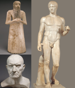
Humanism is the emphasizes the value of human beings instead of divine or supernatural matters. Humans have started to become the main focus instead of the gods and goddesses. This system was most common in Ancient Greek Art era and showed the parts of humans that were most valuable. The art was focused on detailed parts of human beings instead of the different types of appearances the gods and goddesses may have had.
In Greek and Rome art, statues of gods and goddesses had more features of a human being. They emphasize the body of men and their structure with facial expressions and their poses. In the, it has very detailed parts of mankind for example, hair, muscle, facial expressions, etc. It showed that even though the gods were worshiped, they still look like humans. Nudity was also important to Greek humanism. They embrace the nudity to show that everyone was equal, no matter where one stood socially, the human being physical structure was the same.
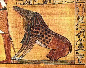
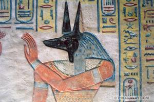
Mesopotamian and Egyptian art, however, focused more on hierarchy with the gods and the humans. They portrayed through their artwork that god and goddesses were much more powerful than other beings. Therefore, when shown in an artwork they were not shown as human beings. Gods and goddesses had heads the same as animals and the body of a man. In the painting of Anubis, he is a god with a jackal head. This shows how god and man were not be equal because the gods had a special appearance. The reason being was to show the power they had over humans and that the gods were superior.
(Painting of Anubis)
(The Kouros figure)
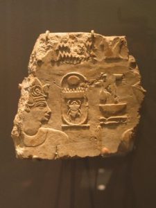
The Ancient Egyptian Art exhibit had a variety of art work. The art work that stood out to me was Royal Statues in Procession. This art work stood out to me because when I saw it, it reminded me a lot of the what we have talked in class. When using formal analysis to understand this piece of art the first thing I thought of was the symmetry of it. This art work does not have symmetry, the shape of it is more of a rhombus than a square. The color of this art piece is solid, a sand color only. What this art work most reminded me about our class was the pop out of the engraved people. When you look to the left of it, the focus of the art work is there. What looks like the king of Egypt, Thutmose III, is placed at the bottom left of this piece. Thutmose III was king of the 18th dynasty. As you look to the right of this art work everything deigned is smaller than the king himself. To the right of the king is another figure who is can be interpret as female king Hatshepsut. In class we talked about the sizes of the figures illustrated in an art work and why there was different sizes. We discussed that a king being bigger than the rest of the things displayed is a way of showing hierarchy, and power. The most important person or item of an artwork is for the most part the focus of that piece. This art work reminded me a lot of our class discussions because of the similarity it had with the art work we discussed in class.
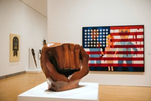
As I saw these art works all I said to myself was, wow. Faith Ringgold’s 1967 painting “American People Series #18: The Flag Is Bleeding” was the art work that caught my attention immediately. The colors of this art work make it stand out, the bloody red and how the woman in the middle seems to be split in half. The left side of the women seems to be alive with her blonde hair. The right side of this women just all seems to be red including her hair. This women is holding the arm of both men illustrated in the painting. The left side is an African American, while to the right side of this woman the man is white. The black man seems to be holding his heart with his hand, with a knife through his hand. The blood around the flag is his. This is representing the violence that was happening during the 1960s. This painting relates to the rest of this exhibit because all together they represent what African American people had to live in the 20th century. Even though this was supposed to represent a different time period, it also represents in a way what is going on today. People of color are still considered minority in the country. The BLM movement had to start when the African American population become such a target to policemen. There have been many cases where black people are shot and no justice is serve. So much of this art work can be connected to what is going on today. The “Soul of a Nation: Art in the Age of Black Power” was such an eye opening exhibit in my opinion.

Unit 1 in Art History, was actually a refresher for me. In high school I took a class called Mixed Media where we focused mostly all semester in formal analysis. Although the class was meant to show how to utilize all kinds of materials and color in an art work, it also showed us how with that mixture we could convey the viewer a message. That is what formal analysis is, the visual structure the artist uses in order to give a message to their art piece. The artist decides to use specific lines, colors, shapes, and even material in order for their art to represent and mean something. They shape their art work with visual structure that allows the person viewing it to analyze it by the specific elements shown.
I remember having to use principles of design and elements of design to describe and understand an art work. When looking at a painting everything needs to be taken into consideration. From the materials used, to the color, and the placement of specific objects. Together everything becomes one in order to help the artist make their message visual to the audience. Using negative space, positive space, balance, symmetrical or asymmetrical, it all contributes to the meaning behind the art piece and in this class I began to understand how this even tides down the historical context. Not only is the visual structure important when trying to see and understand an art work but so is the history behind it.
Depending on the time period an art work was created it can also influence the message one is trying to receive. Not only using formal analysis is important, but the time period it was created in or the time period it was created to represented is needed to be taken into consideration. The history behind it can help you understand more why an artist may have chosen to use only black and white or specific shapes or shape sizes. For example in one of the painting we analyzed in class the king in the painting was at the top register and was the biggest person/ object in the painting. This was showing hierarchy and each register was used to show the difference in the social classes and different labor being done in each class. When learning about formal analysis in Unit 1 it refreshed some of the information I had already learned and also made me aware of the historical context and how that also influences the meaning behind the painting.
Lastly, one of the most interesting things I learned in this Unit was about the banking method. Paulo Freire described the banking model as a method where the teacher uses their power to cut students creativity. With this method what teachers are doing is “depositing” the information into a students mind but they fail to realize that a student is just holding on to the information to pass their exams. The students are no longer understanding the information but rather are just remembering it at the moment. This method of teaching is seen as a way of oppressing the student’s opinions and restricting them from contributing to their own learning.
Unit 1 in Art history has been a refresher to my learning, but has also added to the information I already knew. It has also taught me new things and made me understand how to correctly “read” an artwork.

I really agreed with everything Alex posted on his blog post. Art is a way for a message to be conveyed and for creativity to flow. His post is similar to mine in the set up as well as the context. I also like him took a class my senior year and it gave me so freedom to explore all types of arts. Art is a great way to send a message out as well as express feelings that can not be said.